
Graphic Design II · Event Design · Brand Identity · Spring 2026
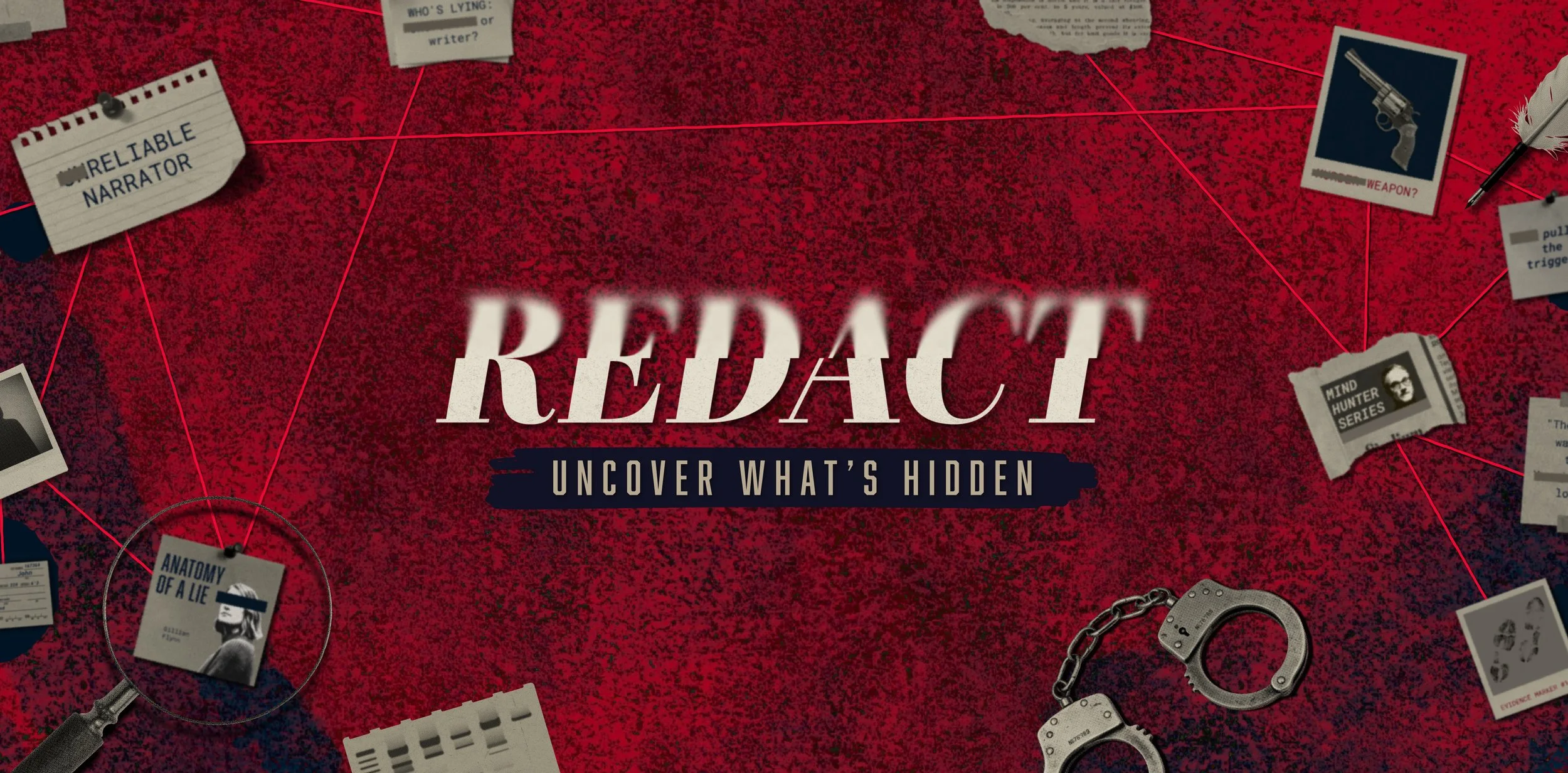
REDACT is a crime fiction conference exploring the art of investigative storytelling.
My Role: Creative Director & Brand Designer (Brand Identity, Stage Design and Animation, Wayfinding)
Anka Narimanyan: Lead Brand & Touchpoint Designer
Willow MacNeil: Digital Content Lead
Design Team
REDACT: The Crime Fiction Conference is a full conference brand identity my team and I designed for our Graphic Design II course. The brief challenged us to conceptualize a branded conference from the ground up, defining its purpose, audience, and theme, then building a cohesive visual identity system to match. As Creative Director and Brand Designer, I led the brand identity, stage design and animation, and wayfinding system, working alongside teammates handling touchpoint design and digital content, extending the identity across the full guest journey, before, during, and after the event.
Project Overview
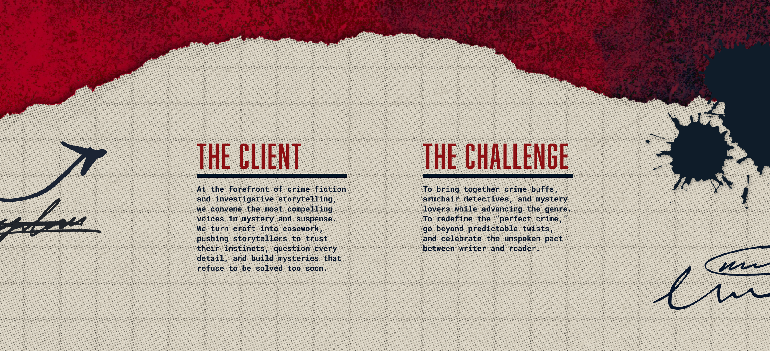
Beyond designing a visual identity, the challenge was inventing an entire conference concept from scratch: its purpose, audience, and tone, then building a brand gritty and immersive enough to convince crime fiction fans it was real, consistent from a phone screen to a full stage production.
Challenge
Our team began by exploring several creative directions for the conference concept. Together, with input from our professor, we chose to move forward with my direction: a crime fiction conference built around a gritty, forensic mystery aesthetic. From there, I led the development of a torn-evidence, case-file identity, crime scene photography, and detective board threads, then extended that system consistently across every stage of the guest experience, from digital content to the physical conference space.
Solution
Research
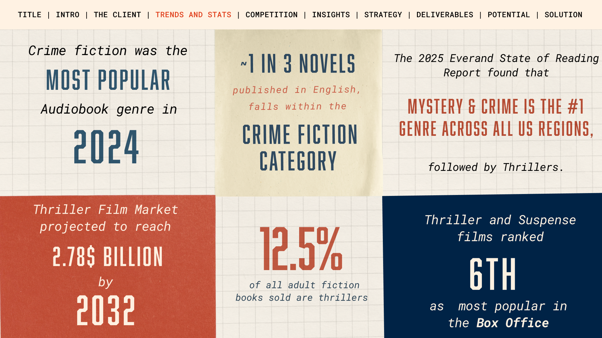
Before any design work began, our team researched the crime fiction landscape to ground the concept in real data. Crime fiction is one of the most popular literary genres worldwide and the top U.S. audiobook genre in 2024. We defined three target audiences, writers, industry professionals, and genre fans, and benchmarked against competitors like Bouchercon and CrimeFest to find where REDACT could stand apart.
Brand Strategy
That research shaped our positioning: REDACT as the premier gathering bridging fiction and true crime, with a brand tone we defined as "gritty, unflinching, and a little cliché", intentionally leaning into genre tropes rather than avoiding them. From there, we outlined potential programming, keynote speakers, workshops, and an escape room experience, to bring that positioning to life before moving into visual identity.
Design Process
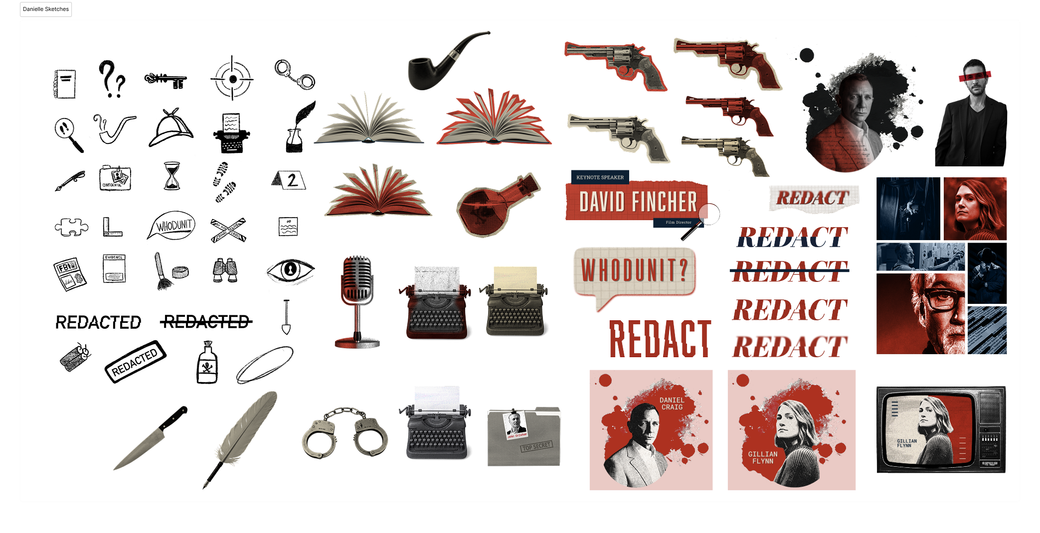
With that direction set, I began translating the brand's tone into visual language, gathering references in iconography, typography, and mood: detective tools, redaction marks, vintage typewriters, evidence tags, and film touchpoints. These references informed the wordmark's distressed treatment and recurring motifs, handcuffs, magnifying glasses, torn paper, carried throughout the identity.
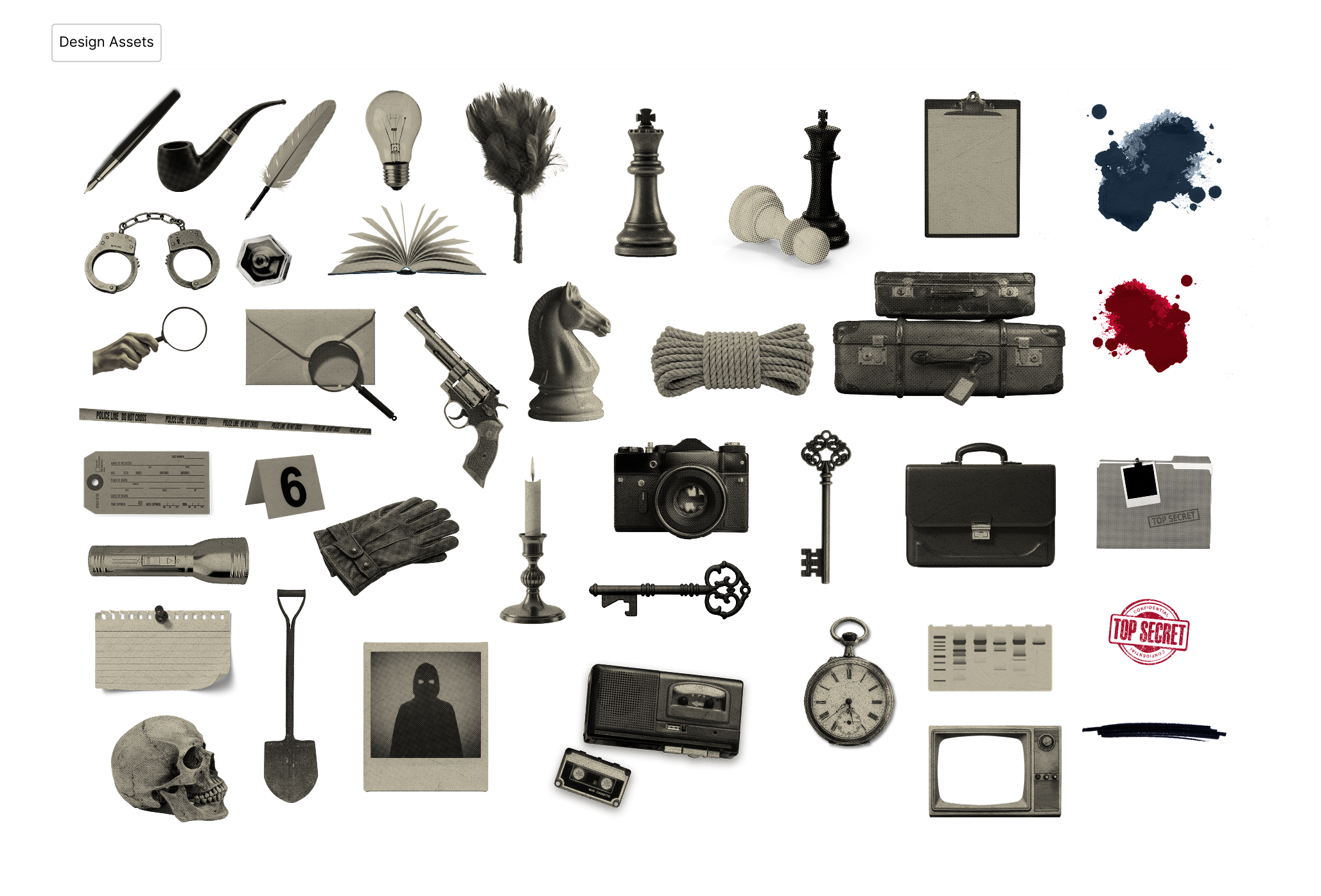
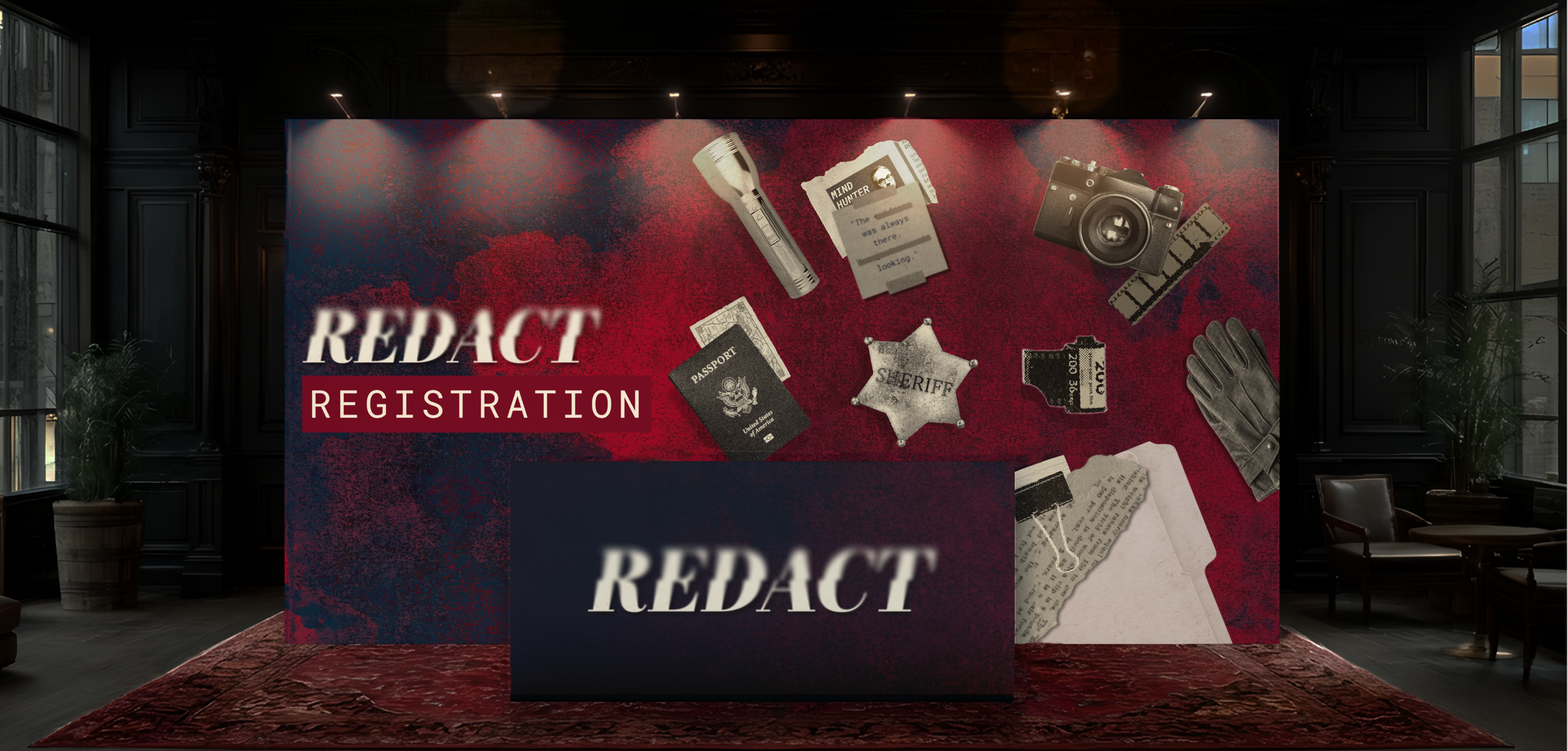
To extend the identity beyond typography and logo, I applied a consistent duotone treatment, aged sepia tones with high-contrast shadow, to a library of investigative props: magnifying glasses, evidence tags, typewriters, weapons, and vintage objects like cassette tapes and rotary phones. This gave the brand a reusable visual language, so any object could be dropped into the system and instantly feel on-brand.
Design Assets
The Logo
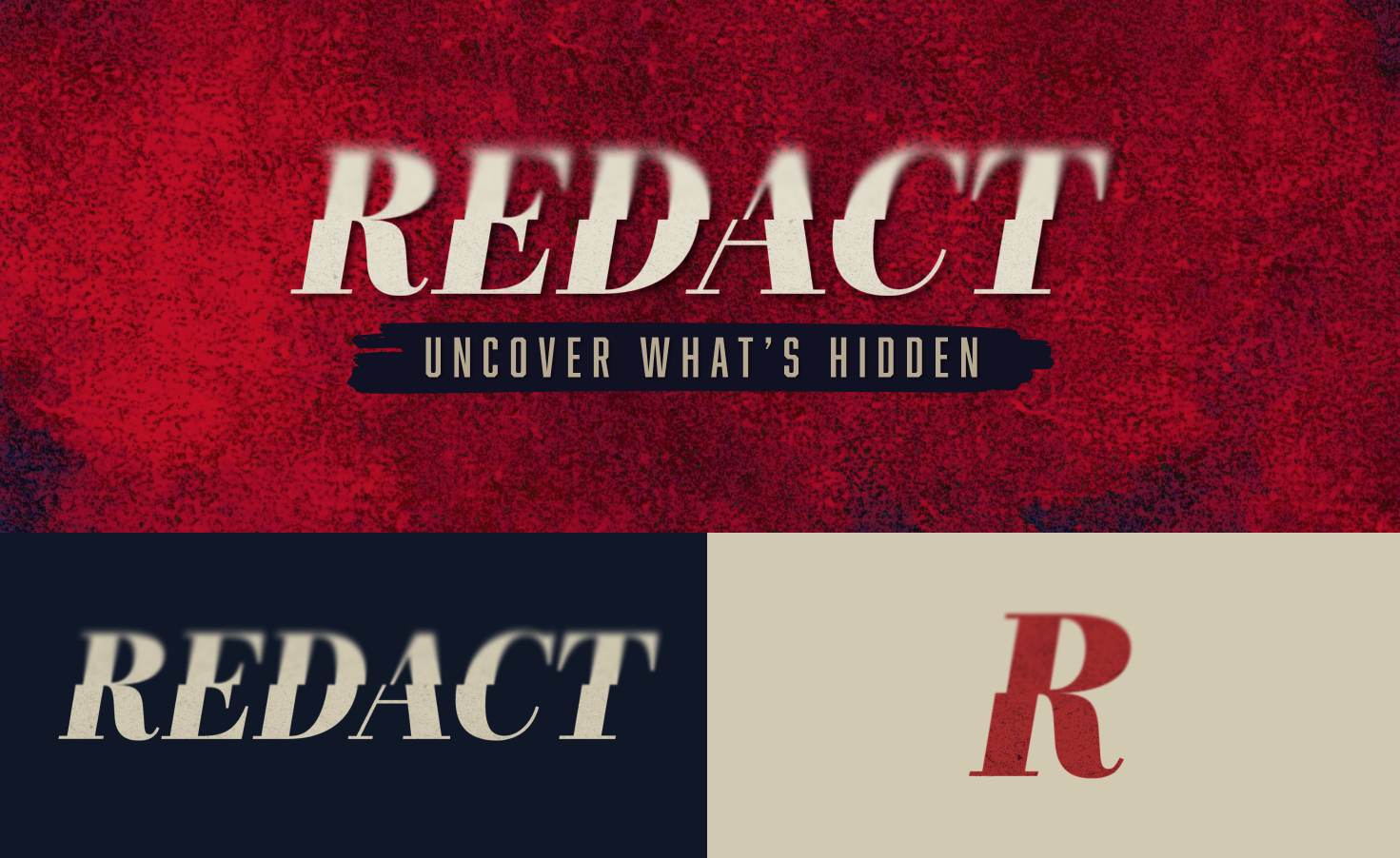
The REDACT wordmark uses a bold serif rooted in the visual language of headlines and classic crime novels, conveying credibility and narrative weight. A subtle blur across the upper half of the letterforms nods to the act of redaction itself, hinting at secrecy and information withheld, while keeping the mark confident and legible enough to anchor every application.
Typography
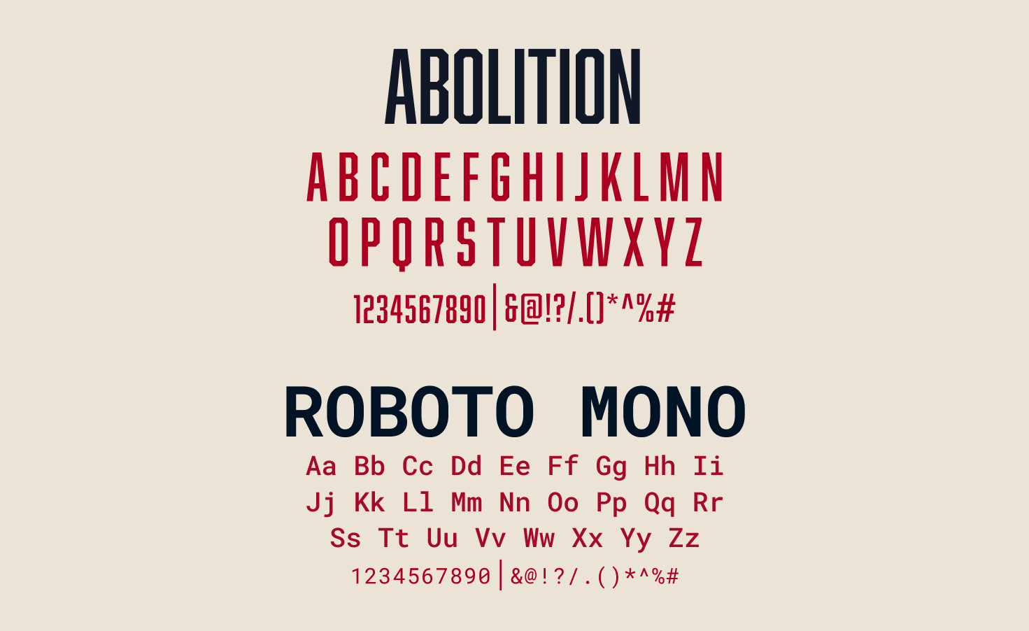
We chose Abolition, a condensed, commanding display type, to handle headlines and high-impact messaging, evoking the authority of investigative documents. We paired it with Roboto Mono, a clean monospaced typeface that references case files and typewritten evidence, used for body copy, captions, and metadata where clarity matters most. Together, the two typefaces balance bold declaration with investigative precision.
Color Palette
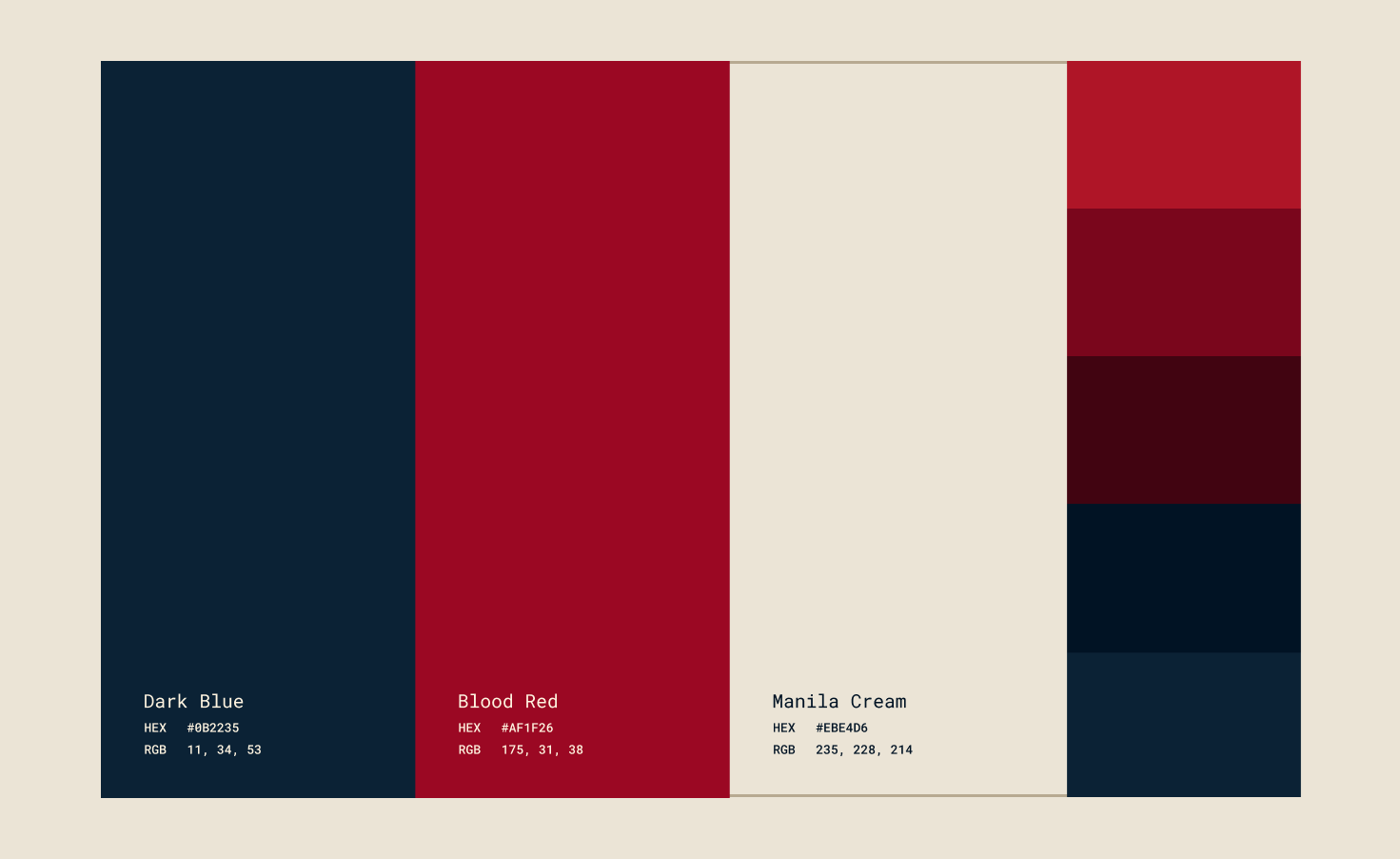
I wanted the colors to feel like part of an actual investigation. Dark blue is the base, cold and controlled, like the room where the real questions get asked. Red breaks through it: danger, urgency, the redaction marks the brand is built around. A warm, aged cream rounds it out for anything meant to feel like real evidence, worn paper, old fingerprints, files pulled from a box that's been sitting for years.
Attendee Journey
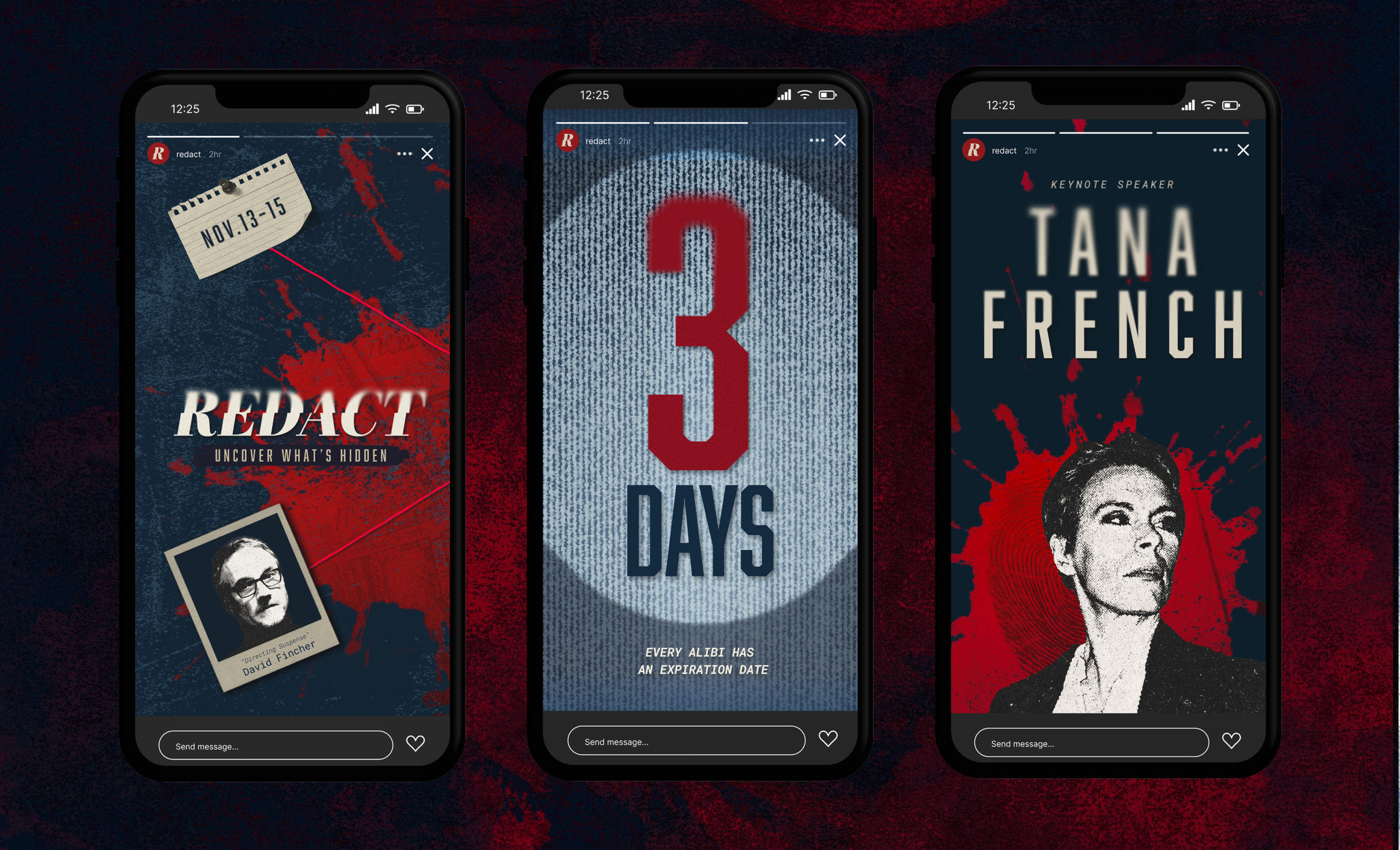
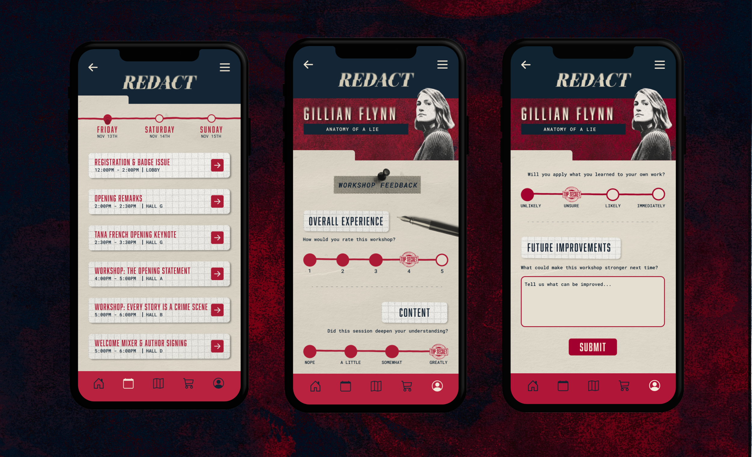
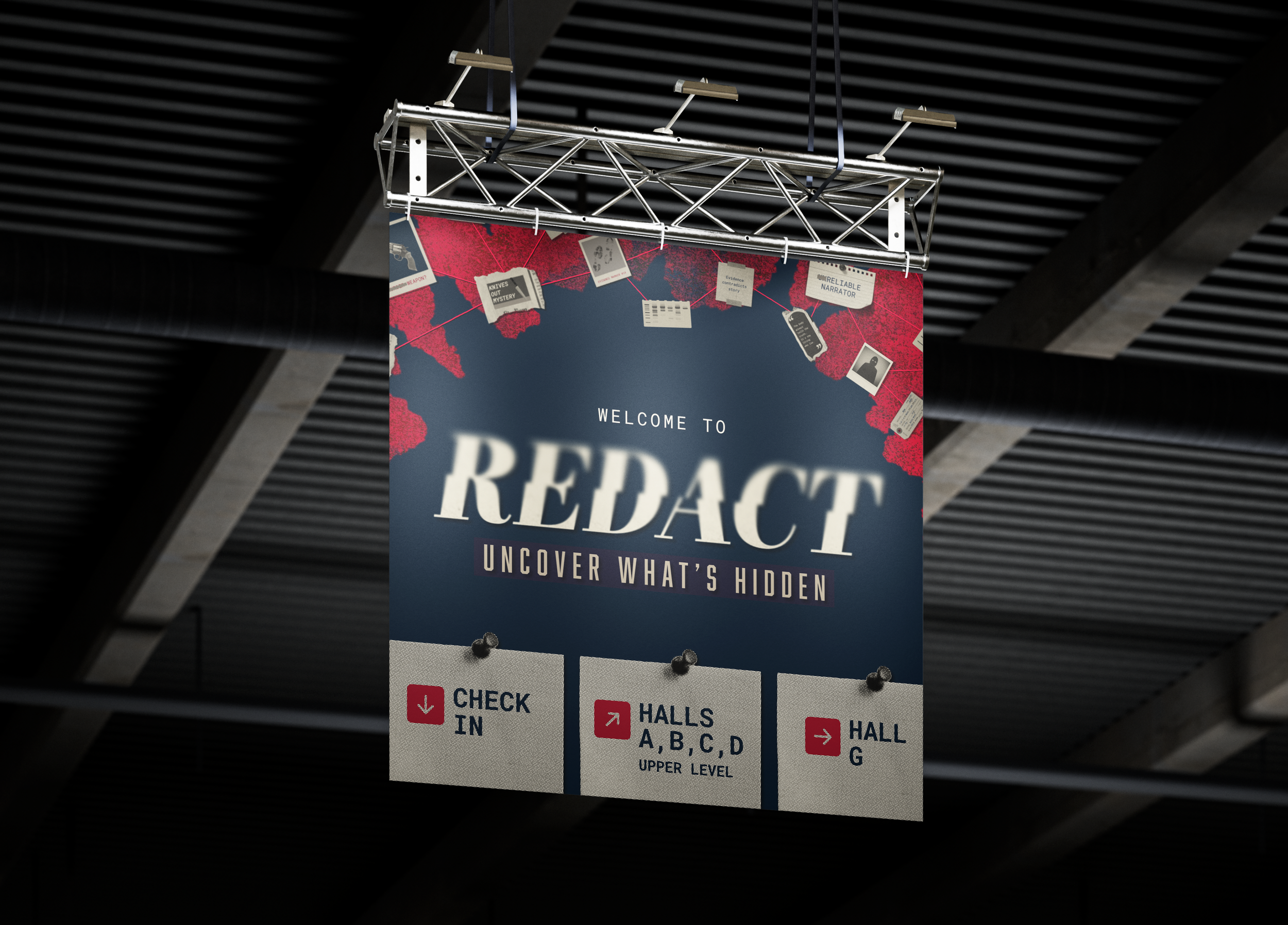
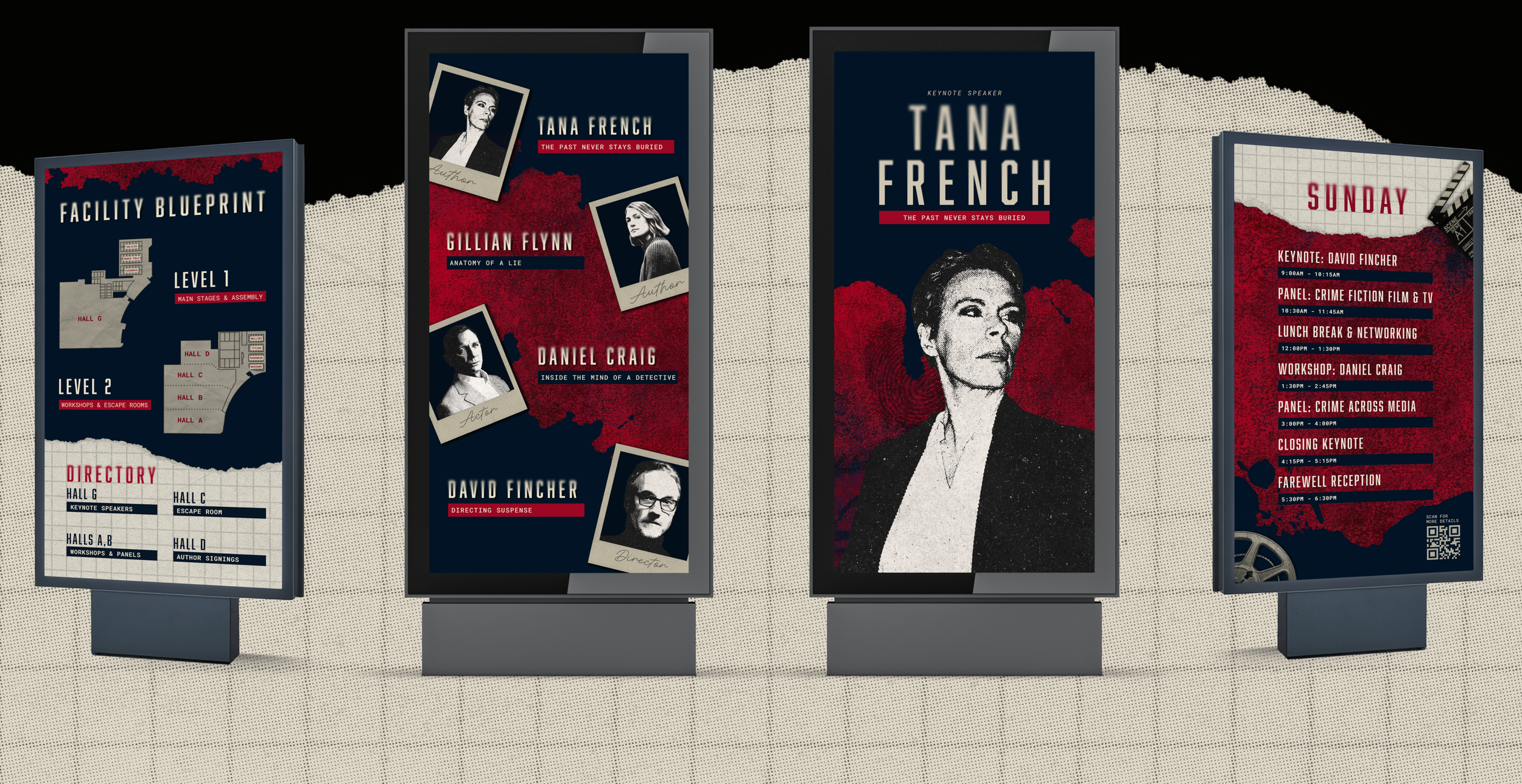
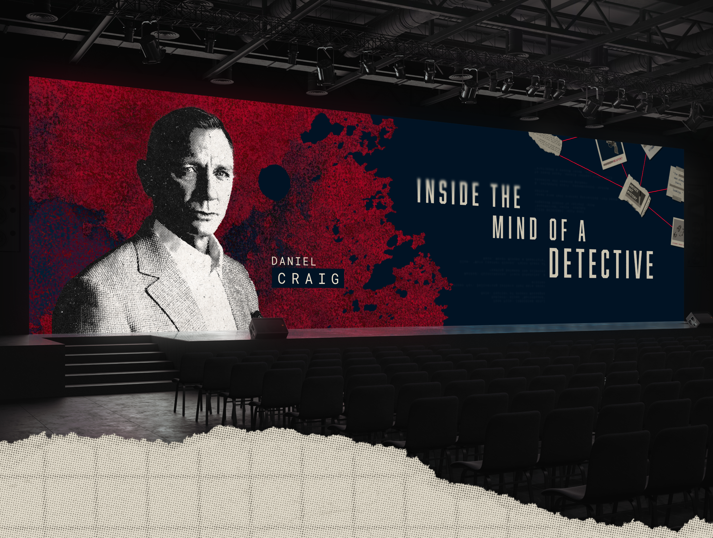
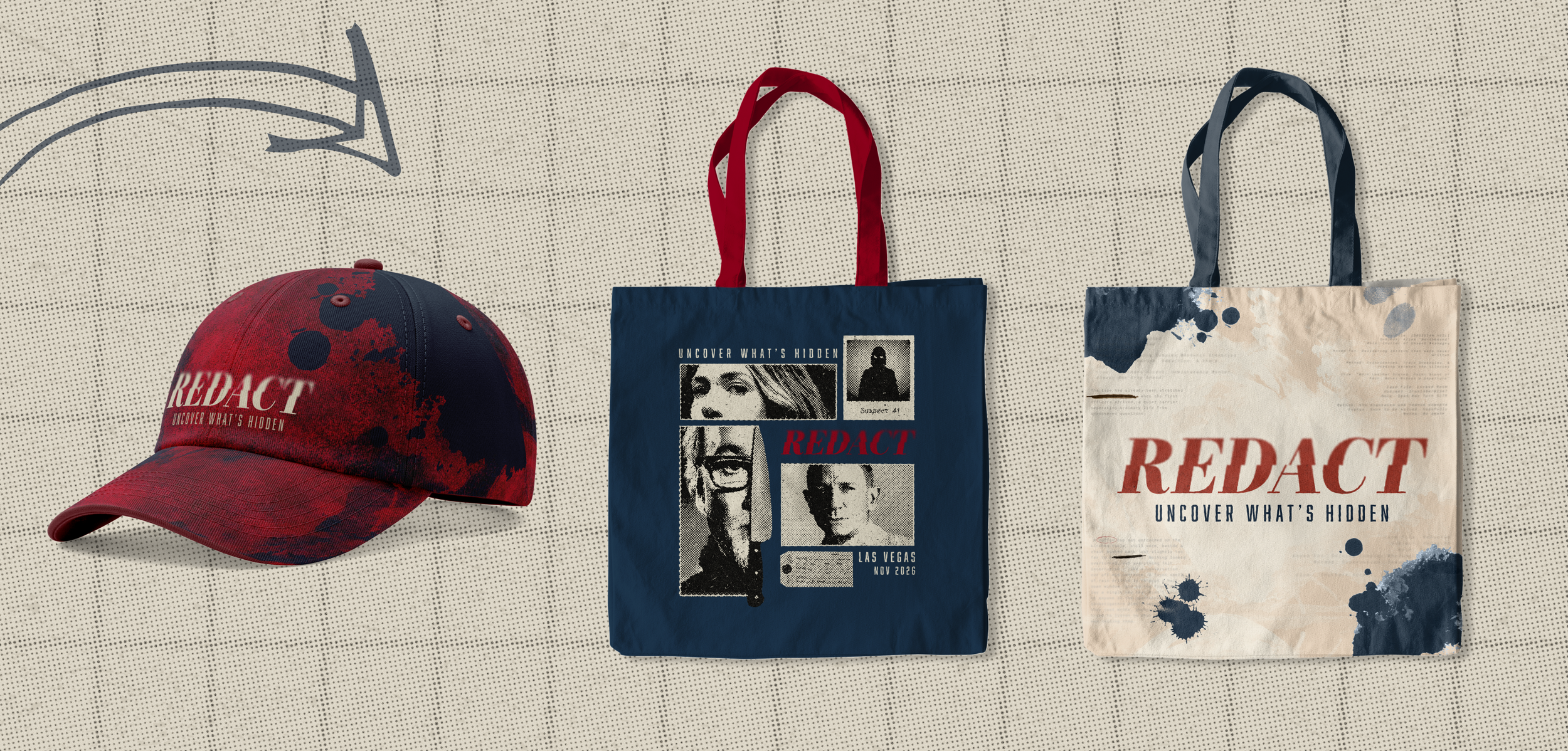
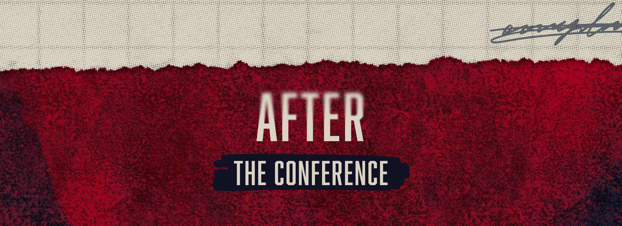
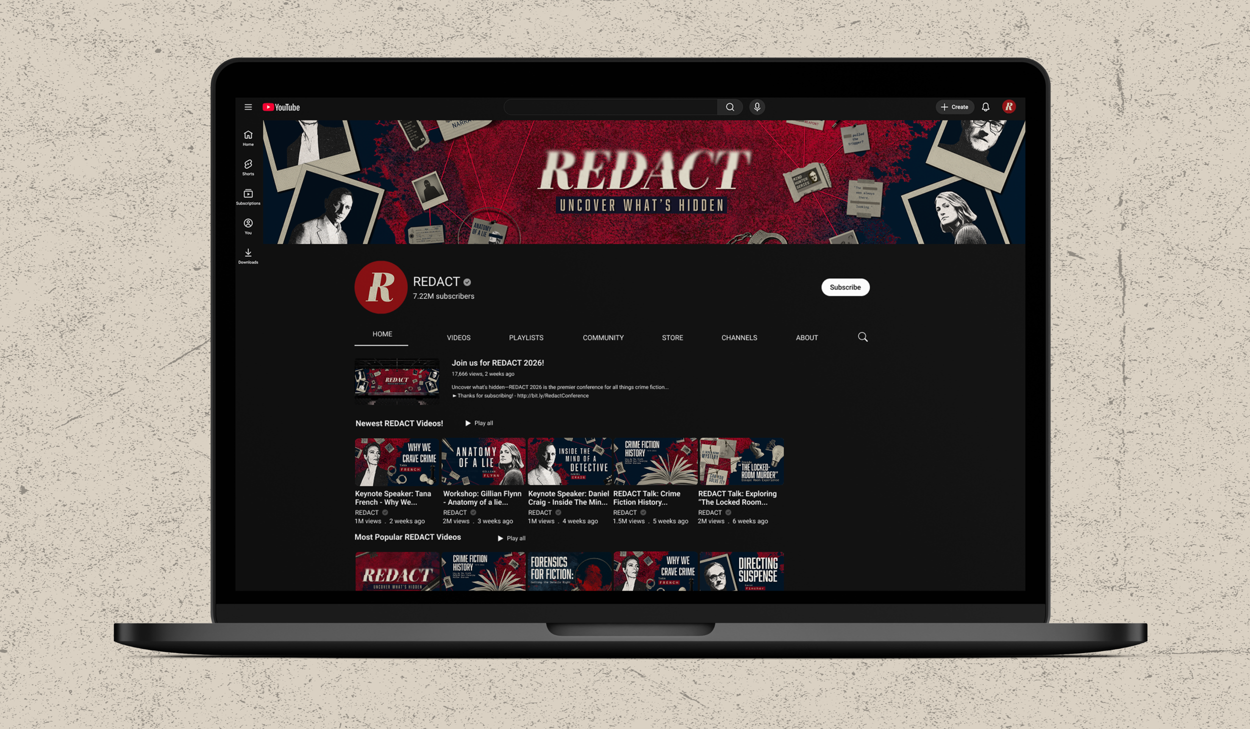
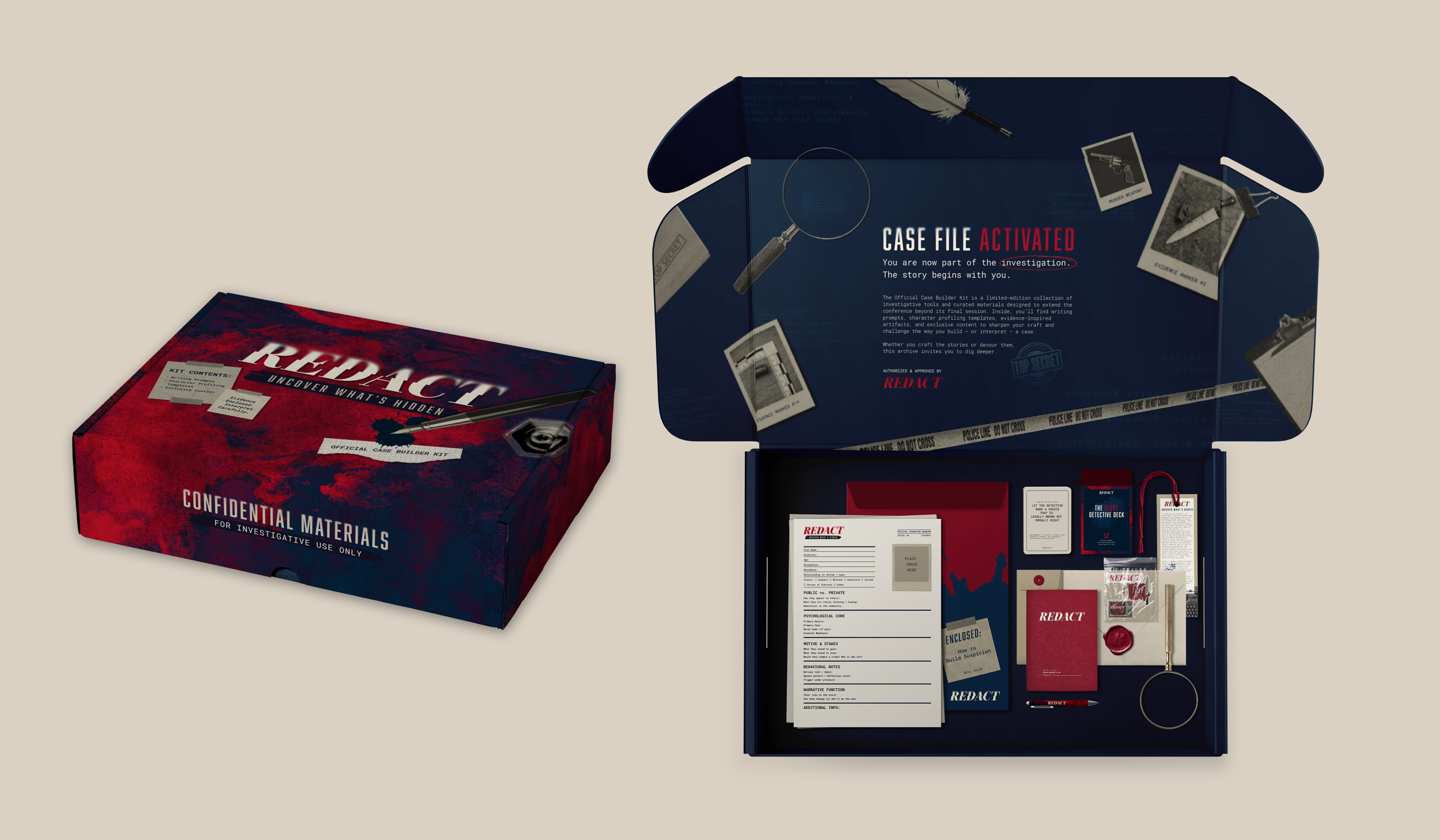
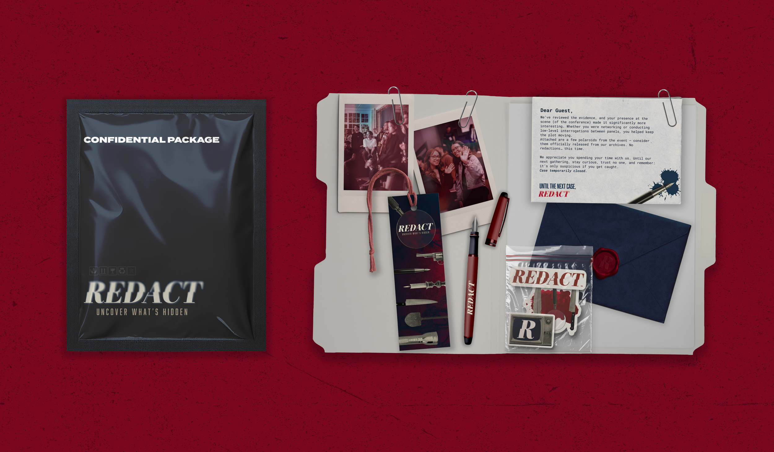
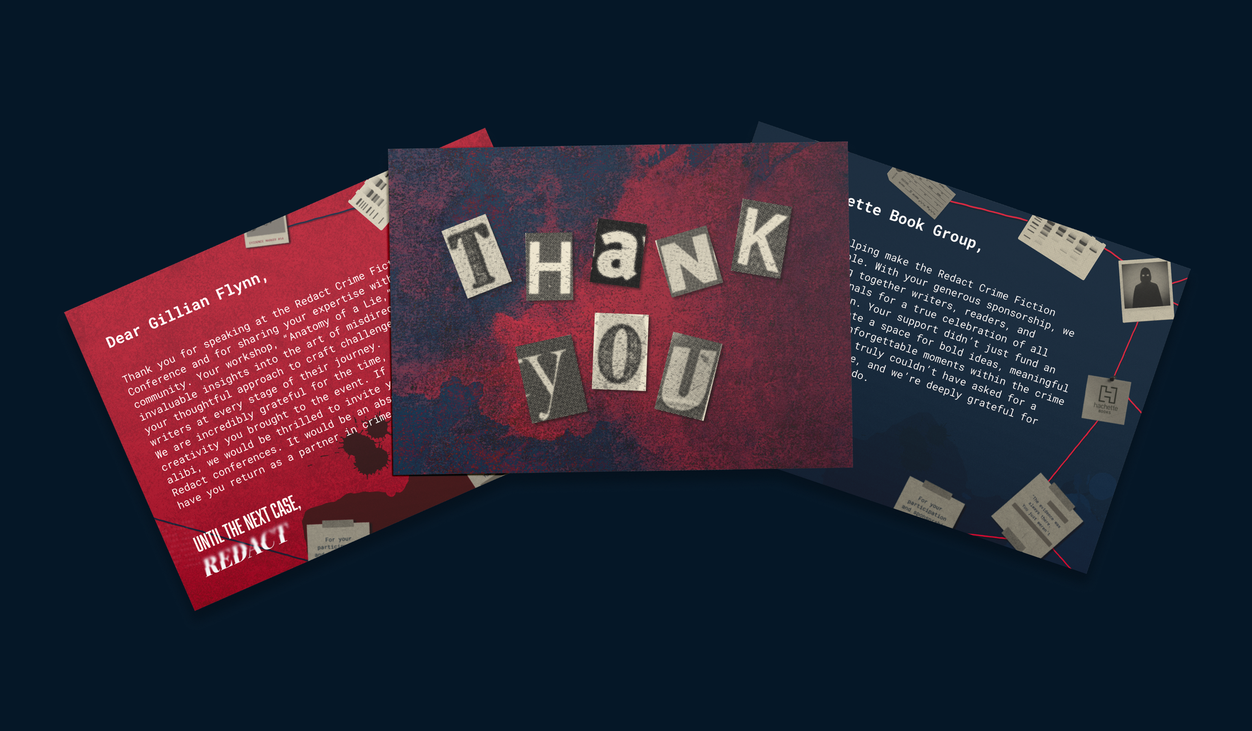
To bring the brand to life beyond a static identity, we mapped the REDACT experience across three stages: Before, During, and After the Conference. Social content and countdowns build anticipation ahead of the event; signage, stage design, and badges immerse attendees once they arrive; and merchandise, thank-you materials, and a Case Builder Kit keep the brand with them long after the final session ends.
After eight weeks of work, our team presented REDACT alongside our classmates in a class-wide review, where everyone walked through each group's conference concept. In a vote for favorite conference, REDACT was selected as the winner, proof that the brand held together as a cohesive, memorable experience