
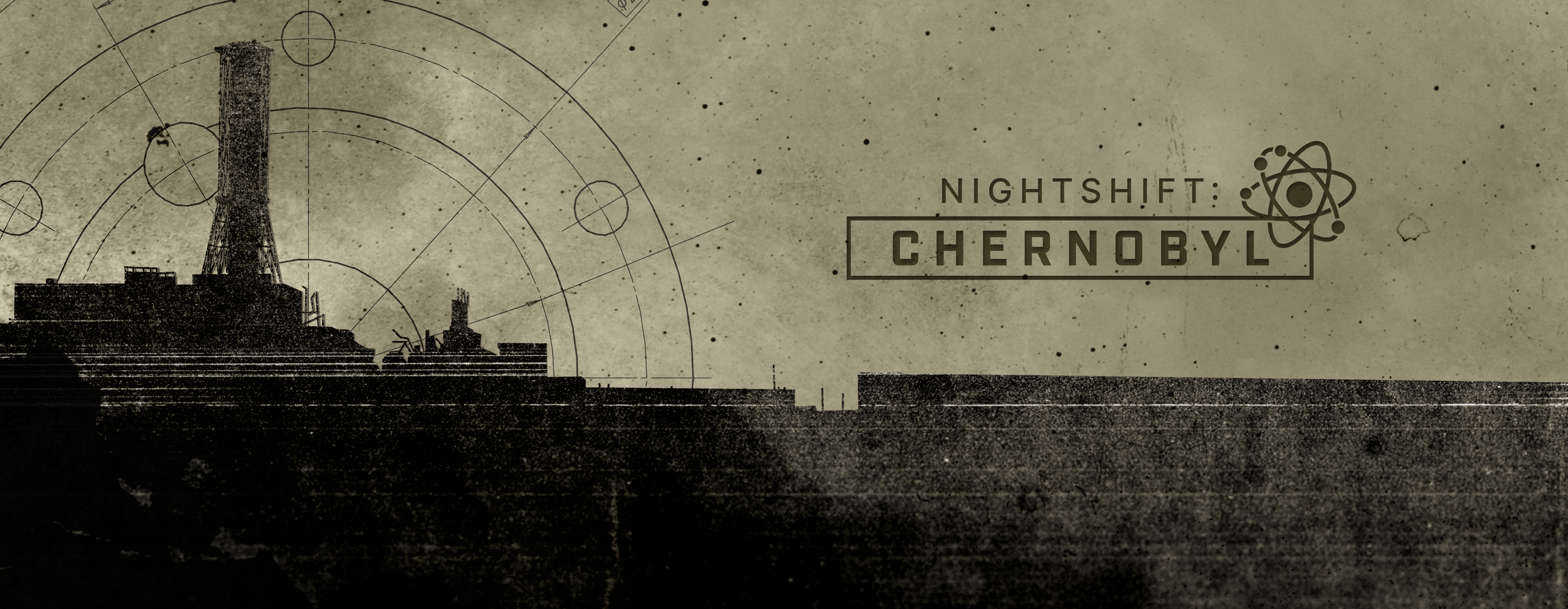
New Media UI/UX · Experiential Design · Brand Identity · Spring 2026
Nightshift: Chernobyl is an immersive exhibition exploring the 1986 nuclear disaster.
My Role: Co-Graphic Designer (Creative director, brand identity, environmental graphics, case study video editor)
Timo Kisyeri: Co-Graphic Designer
Joyce Mallon: Project Manager/Environment design
Luzmarie Castillo Rivera & Anabelle Chiaravalle: Modeling/Lighting/Environment design
RuoChong Wu: Text/image content & Digital sketches
Team & Collaborators:
Case Study Video
Nightshift: Chernobyl was developed as part of a New Media UI/UX studio course pairing graphic design and entertainment design students to reimagine an underused commercial building as a fully immersive exhibition space. Our team designed a spatial brand identity exploring the 1986 Chernobyl disaster, translating archival research into a spatial, narrative-driven visitor journey.
Project Overview
Our team needed a visual identity that could function across eight distinct narrative zones, each representing a different chapter of the disaster's timeline. The system had to balance the rigid, mechanical tone of Soviet-era industrial engineering with the emotional weight of the story itself, while remaining practical enough to guide visitors physically through the space.
Challenge
Our team developed Nightshift: Chernobyl, a spatial identity concept that reimagines a commercial building as a living timeline of the 1986 disaster. We implemented a distinct wayfinding system to guide visitors through each zone, marking their progression through the story. Utilizing a stark, industrial visual system combining large-scale environmental graphics and archival textures, the concept guides visitors on an immersive journey rooted in historical accuracy.
Solution
Design Process
01. Visual Research & Context
Before designing any physical assets, we studied the historic, visual landscape of 1980s Soviet Ukraine to ground the exhibition in reality. Our design direction emerged from three core pillars:
Historical & Visual Research
Soviet Typography
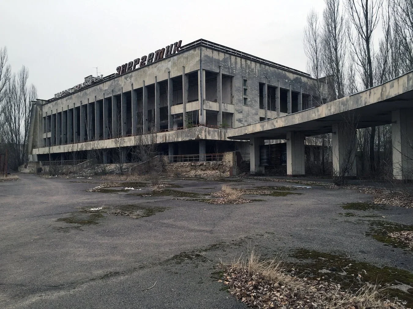
Brutalist Architecture
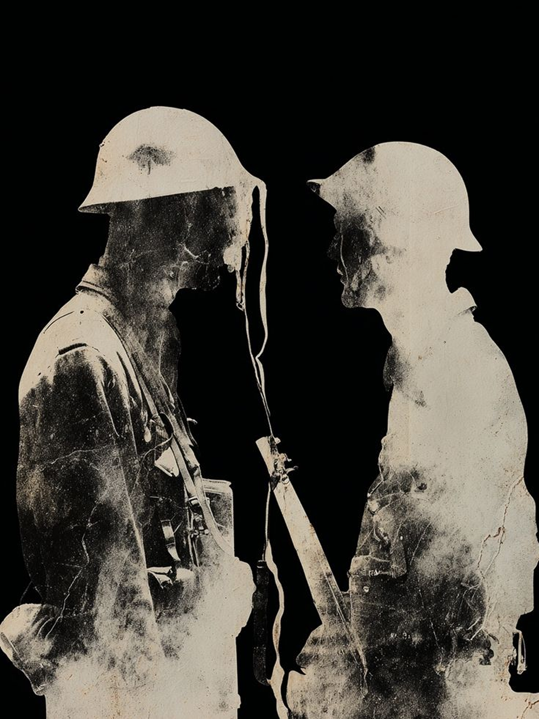
Gritty Textures
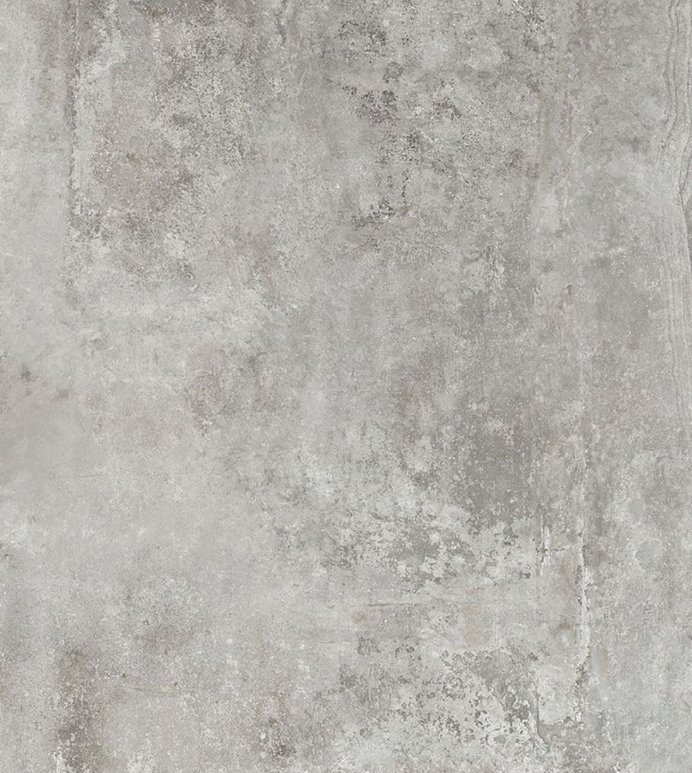
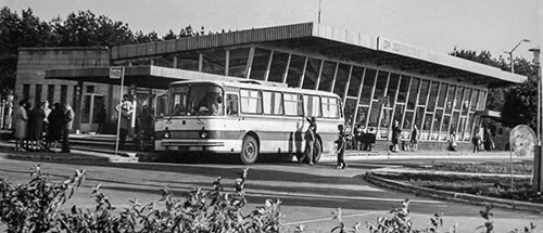
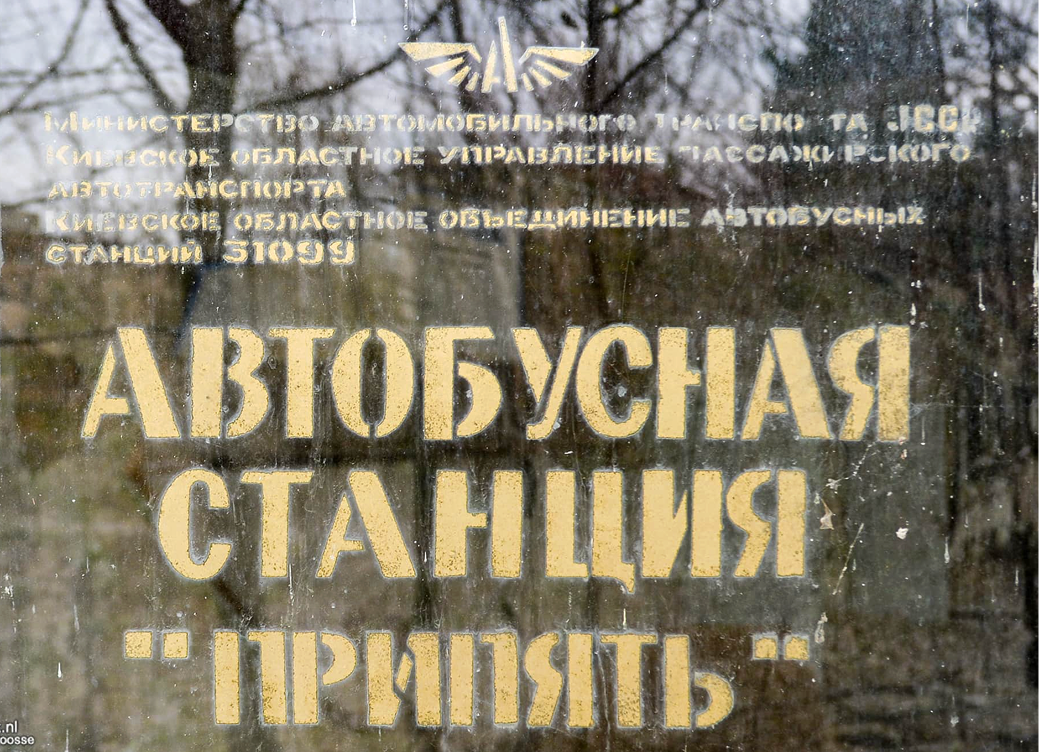
Texture & Contrast (Left): The high-contrast figures inspired our graphic treatment of historical imagery and gave us the overall tactile feel we wanted to achieve throughout.
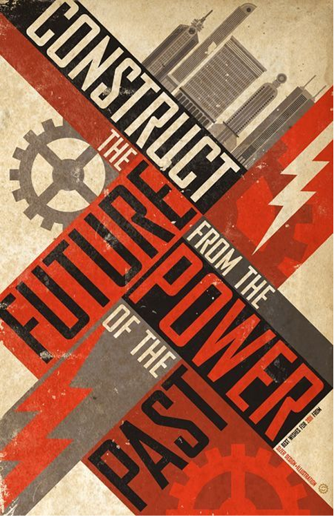
Our design system was guided directly by these two reference images, balancing rigid, engineered structure with chaotic, physical erosion:
Visual Direction & Materiality
Structural Layout & Tone (Right):
Matt Needle’s poster inspired our overall environmental mood. It guided the raw, textured concrete finishes and the subtle, technical blueprint lines to represent
Soviet engineering.

Poster Design by Matt Needle02. The Design System
Drawing inspiration from Soviet control panels, I designed a bold, framed industrial logo with an integrated atomic icon to ground the visual identity in the plant's scientific history.
The Exhibition Logo
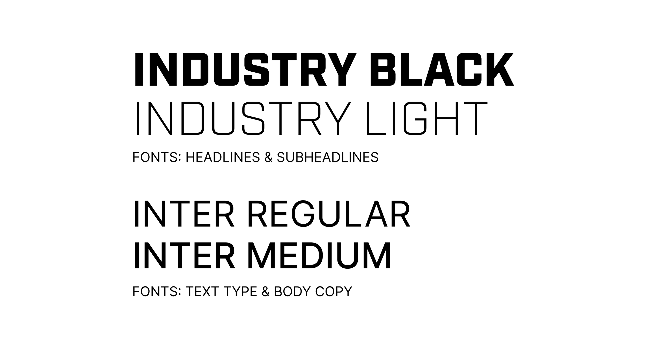
Building on the logo's industrial identity, Timo and I used its bold structural typeface for primary environmental signage, paired with a clean technical sans-serif for body copy and exhibit plaques.
Typography
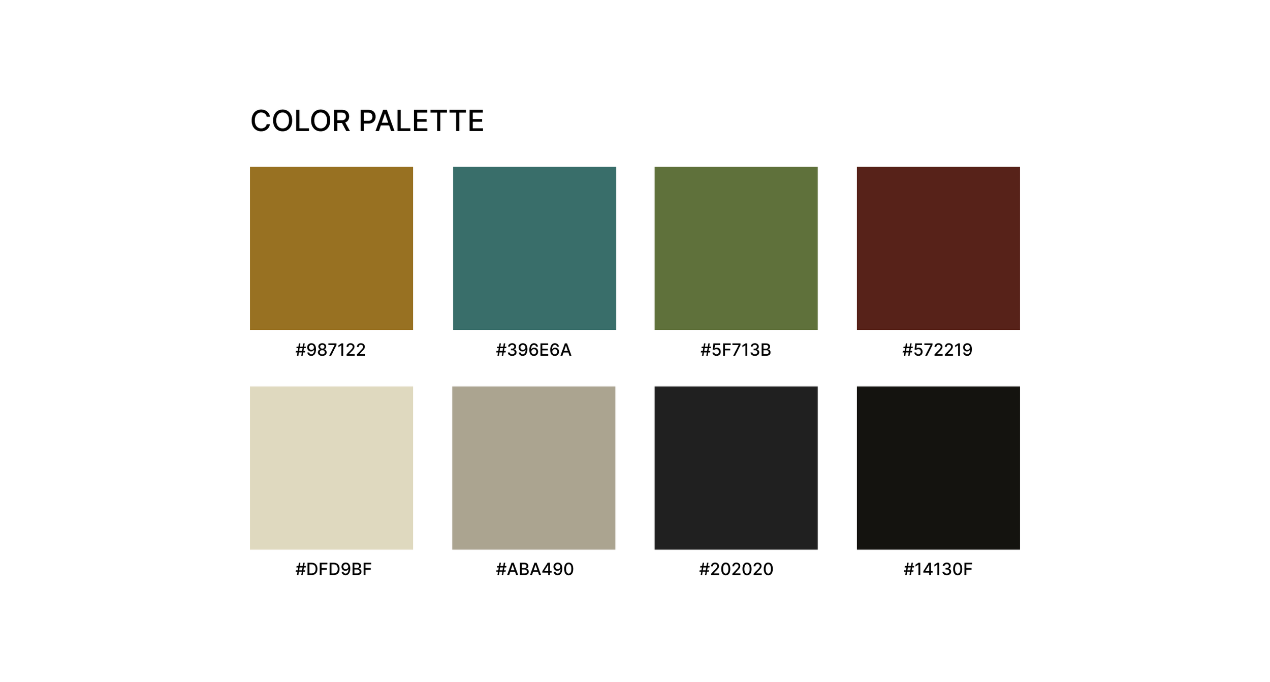
Timo and I intentionally used color to help organize the spatial layout. We assigned four distinct, muted tones to help navigate visitors through the narrative flow:
Color Palette (Wayfinding)
Hazard Yellow: Defines the tension of the Arrival at Chernobyl.
Cyan Blue: Captures the cold, technical feel of the Control Room.
Deep Red: Evokes the high-stakes emergency of the First Responders.
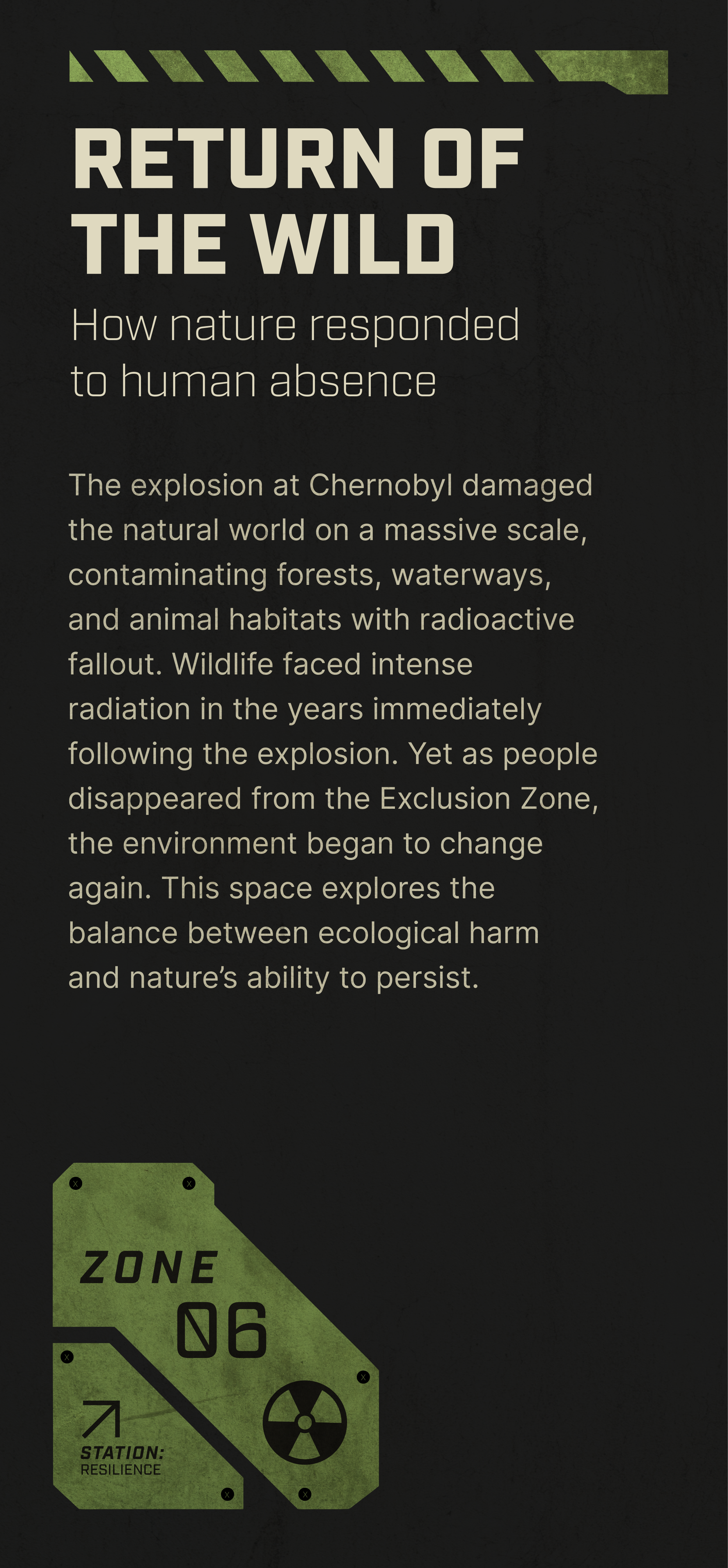
Moss Green: Signals the quiet reclaim of the Effects of Nature aftermath.
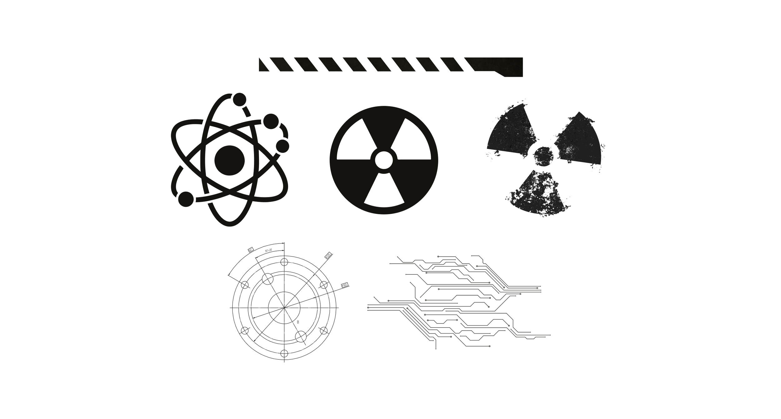
Industrial & Scientific Motifs: I used clean, vector-based symbols, including atomic models, standard radiation trefoils, technical drafting schematics, and circuitry paths, to represent the calculated engineering of the Soviet nuclear program.
The Decay Application: To visually mirror the narrative of the disaster, we layered weathered textures onto the vector icons to give them a raw, worn aesthetic.
I developed a library of technical and scientific motifs to ground the exhibition's graphic language in the reality of a nuclear power facility.
Iconography
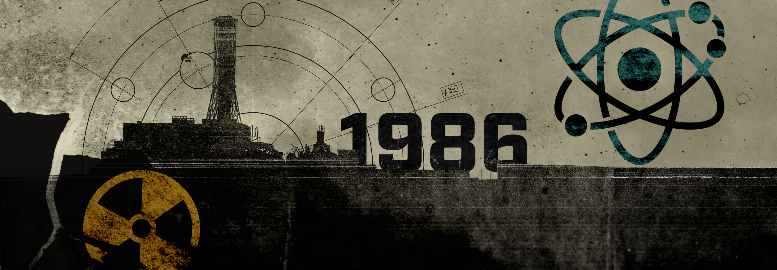
Timo and I curated a collection of raw concrete, distressed paper, halftones, and analog film decay used to weather every digital graphic.
Texture Asset Library

03. Spatial Strategy & Wayfinding
With our visual identity set, we aligned it against the block plan our team developed to map the sequential visitor journey. This allowed us to tailor the graphic system to each distinct physical zone:
Mapping the Journey
Block Plan
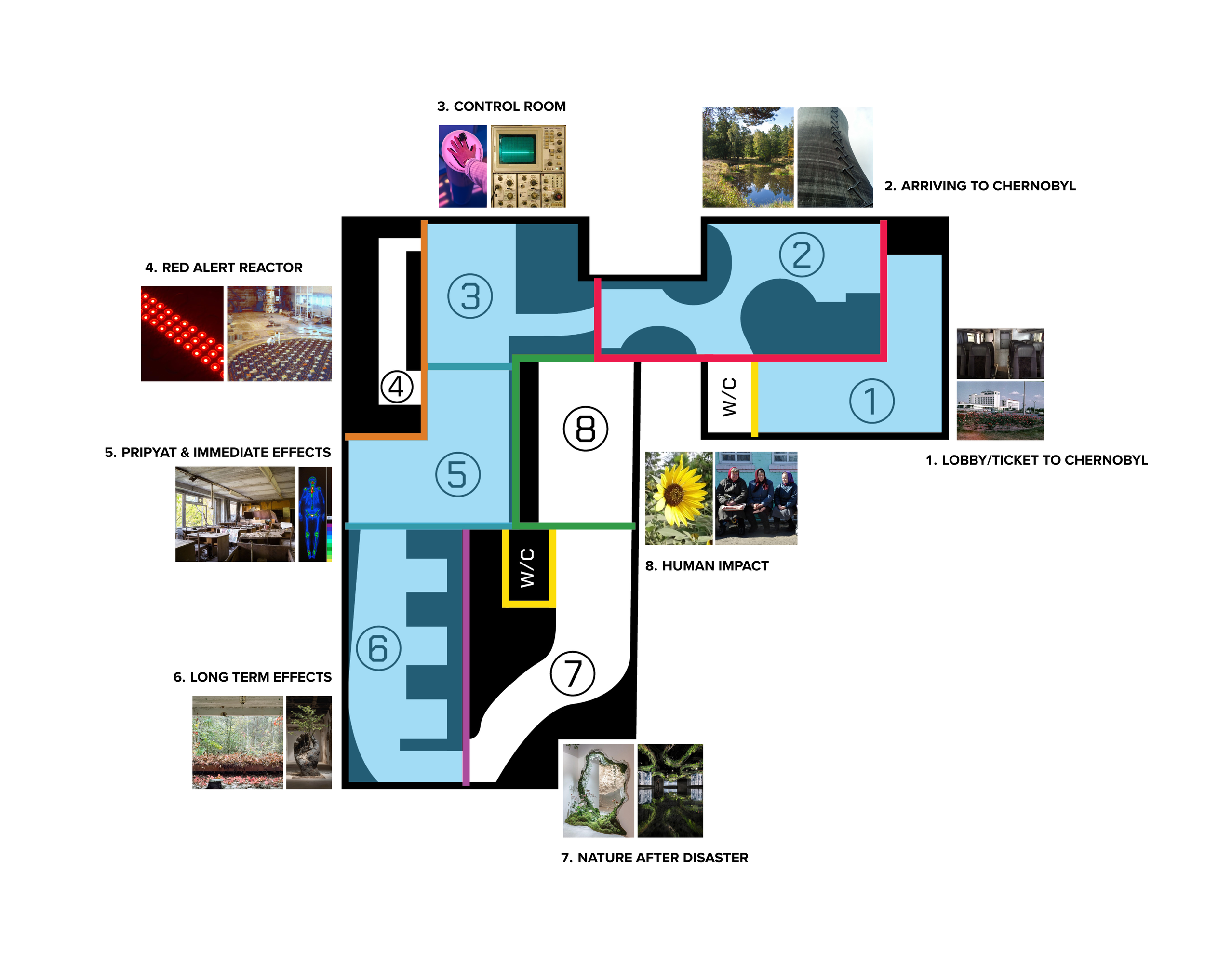
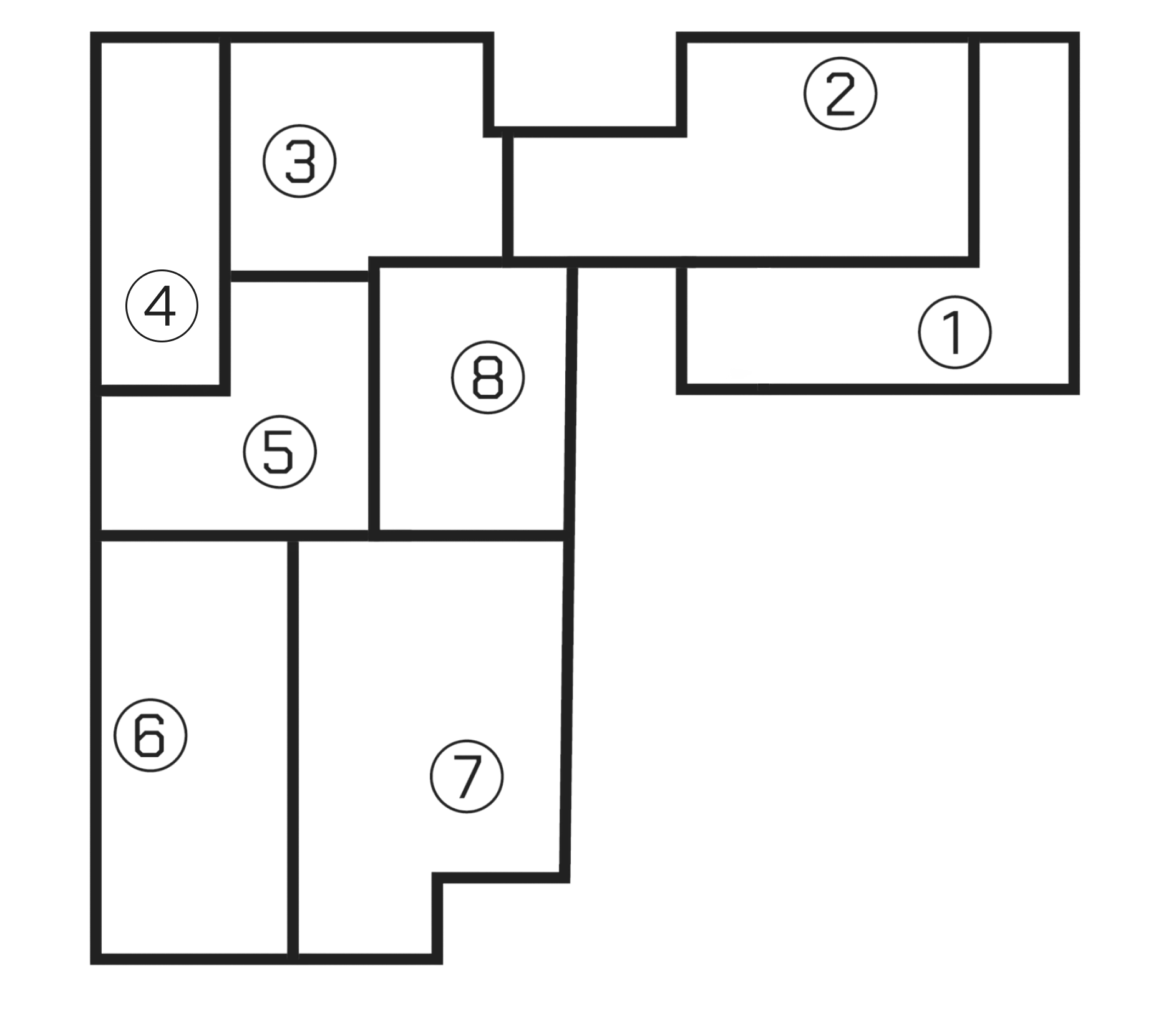
Key:
Lobby and ticketing
Arrival to Chernobyl
Control Room
Red Alert Reactor
Short-Term Effects
Long-Term Effects
Nature After Disaster
Human Impact
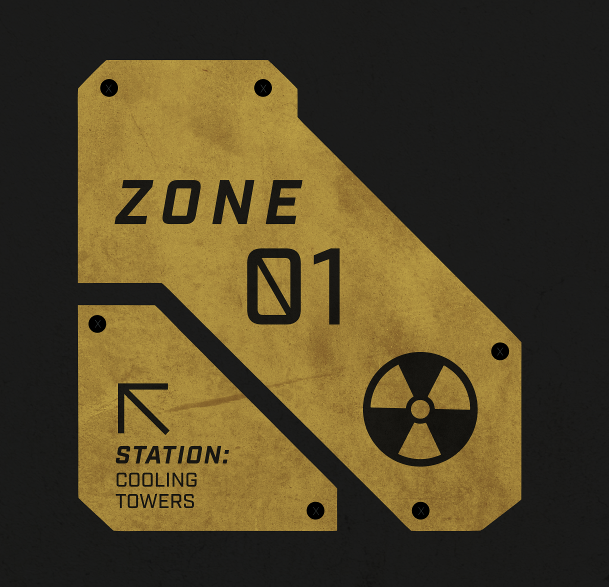
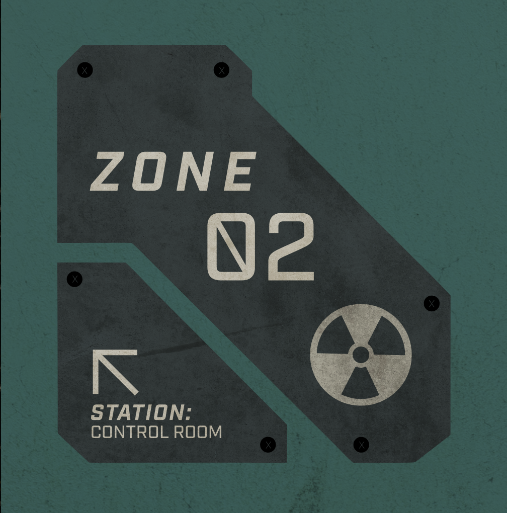
To guide visitors through the physical space, I designed a cohesive environmental graphics and wayfinding system where every plaque and sign feels like a seamless extension of the architecture.
Wayfinding
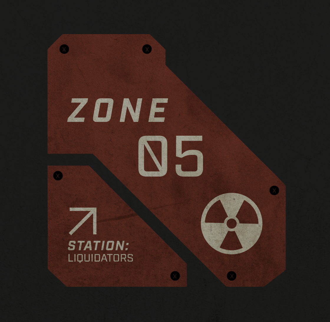
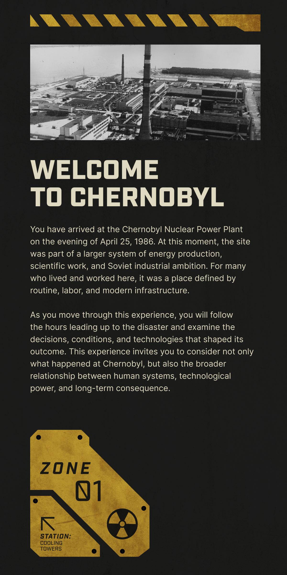
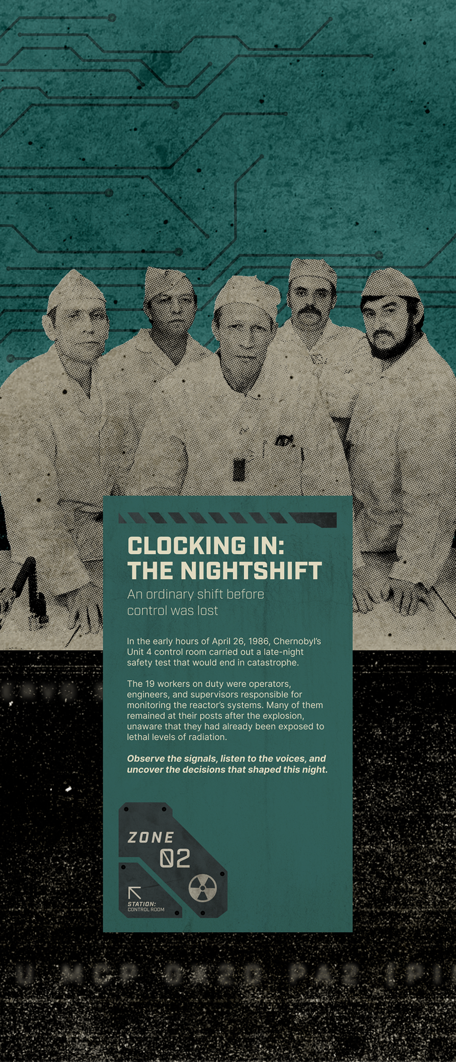
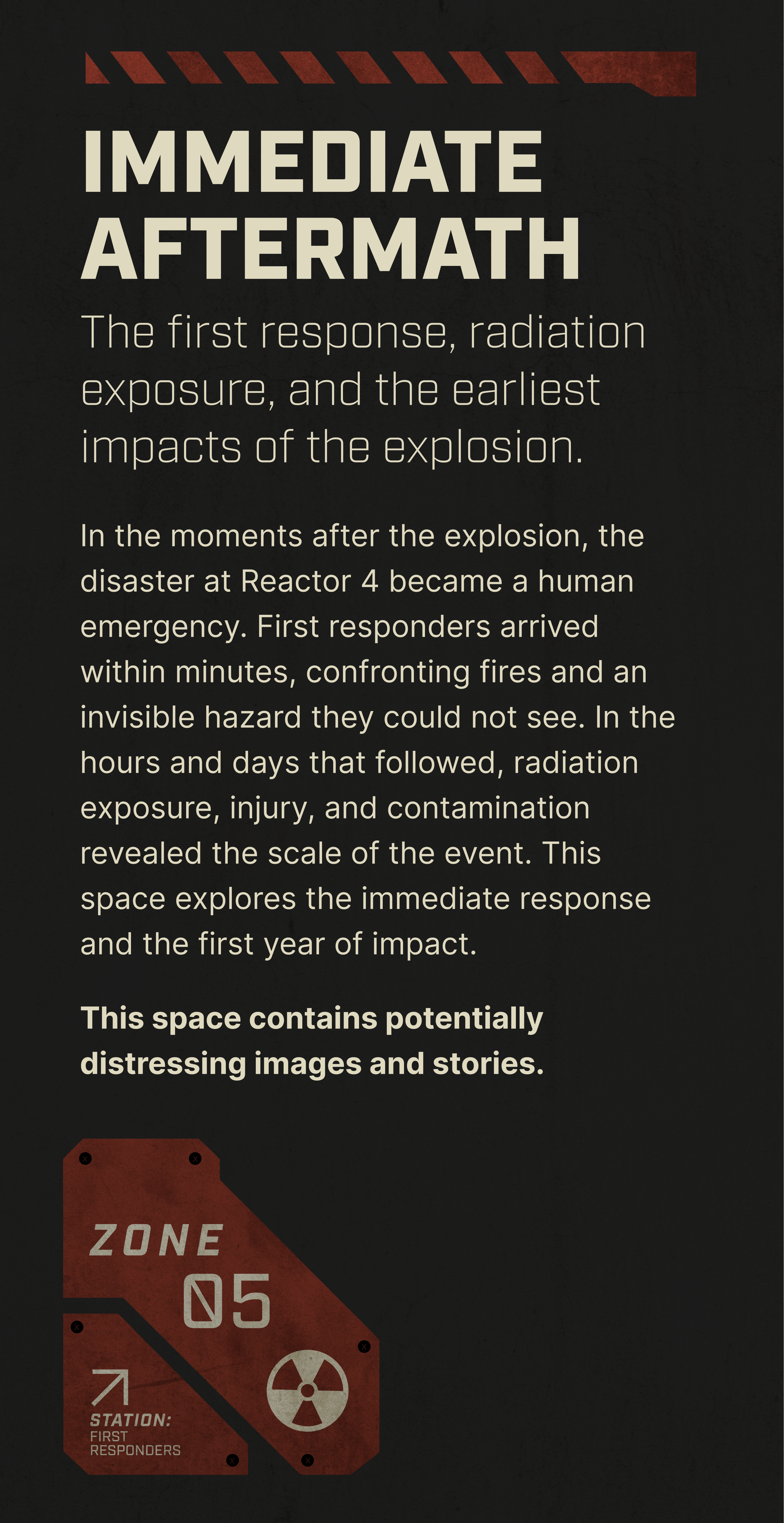
Zone Plaques: Styled like bolted industrial plates, these corner markers use spatial color-coding, clear numbering, and directional cues to orient visitors within the narrative.
04. Exhibit Showcase
Featured Environments
The final exhibition translates our visual identity into a spatial experience. These rooms highlight the journey's core narrative arc and showcase my primary design focus: brand identity, environmental wayfinding, and large-scale graphic installations.
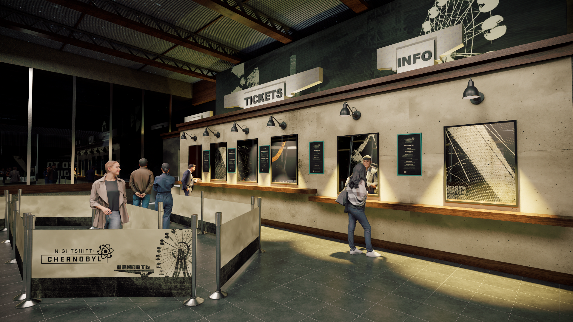
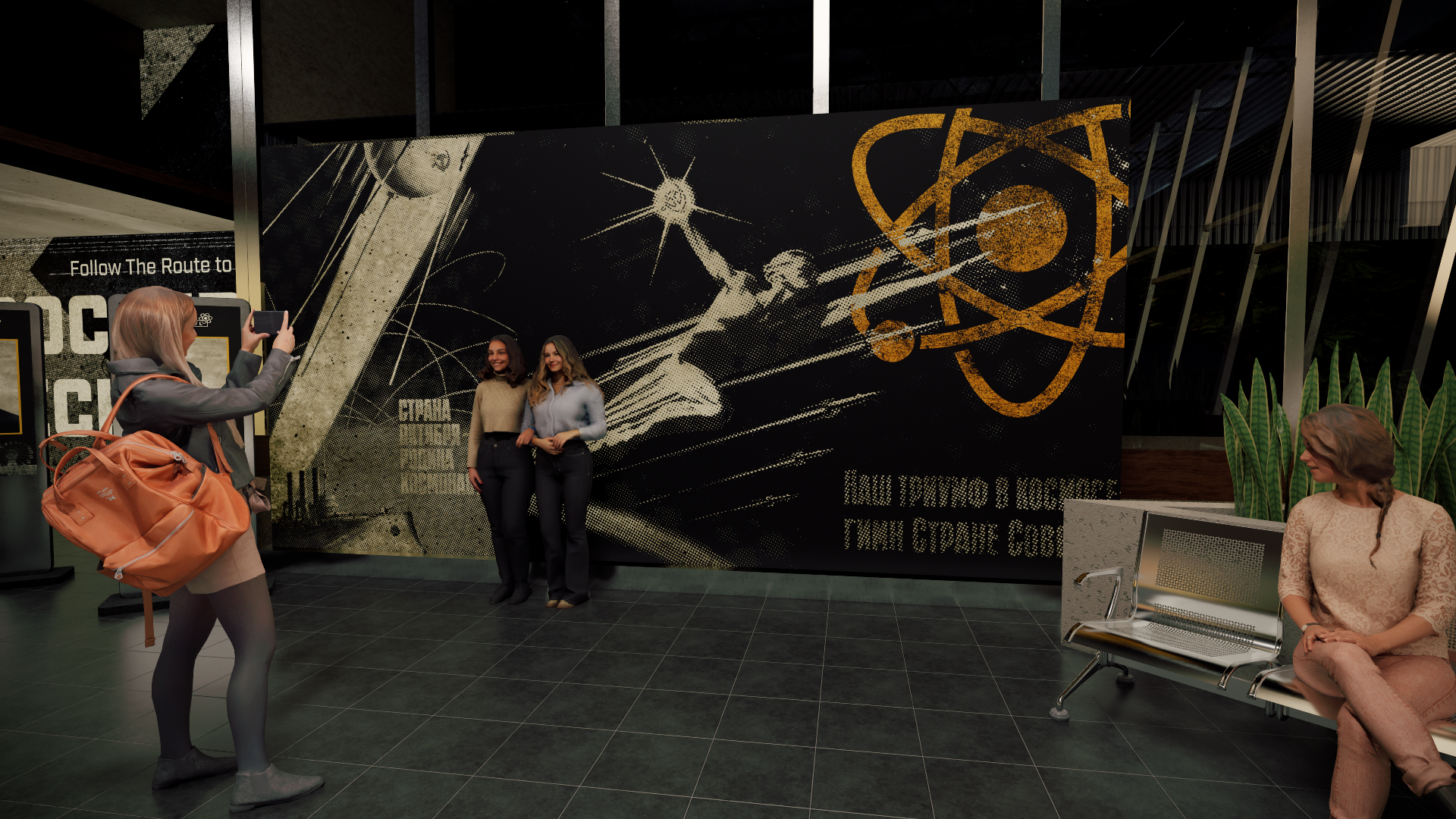
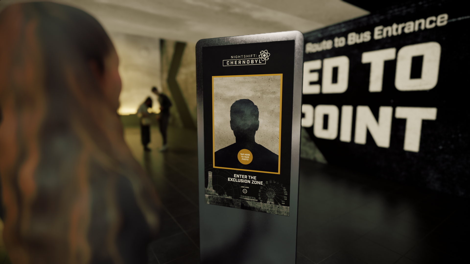
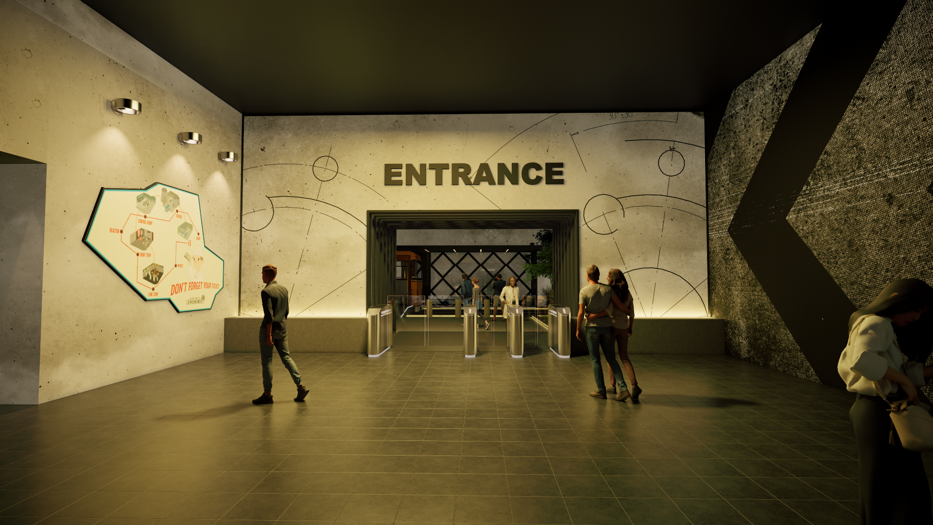
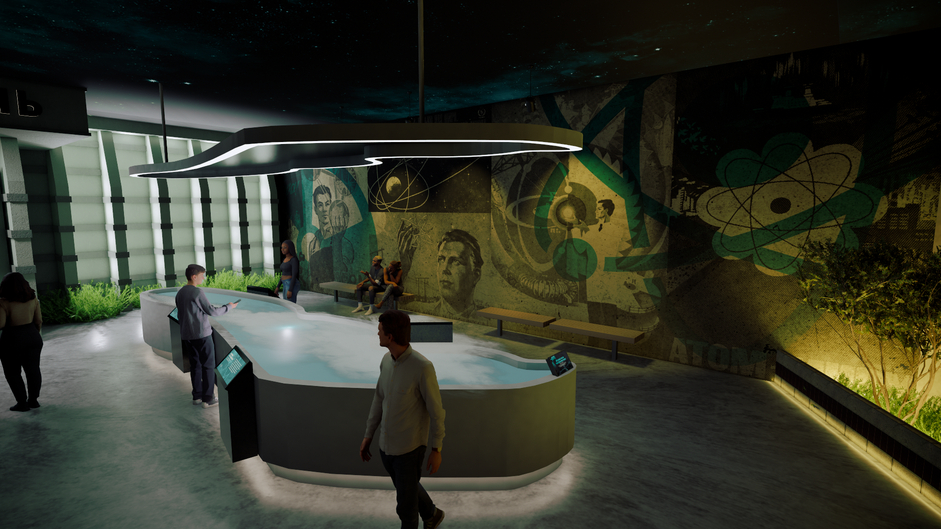
The Lobby: Pripyat Bus Station
The lobby serves as the initial physical threshold, designed to transition visitors from the outside world into the historical setting of the exhibition.
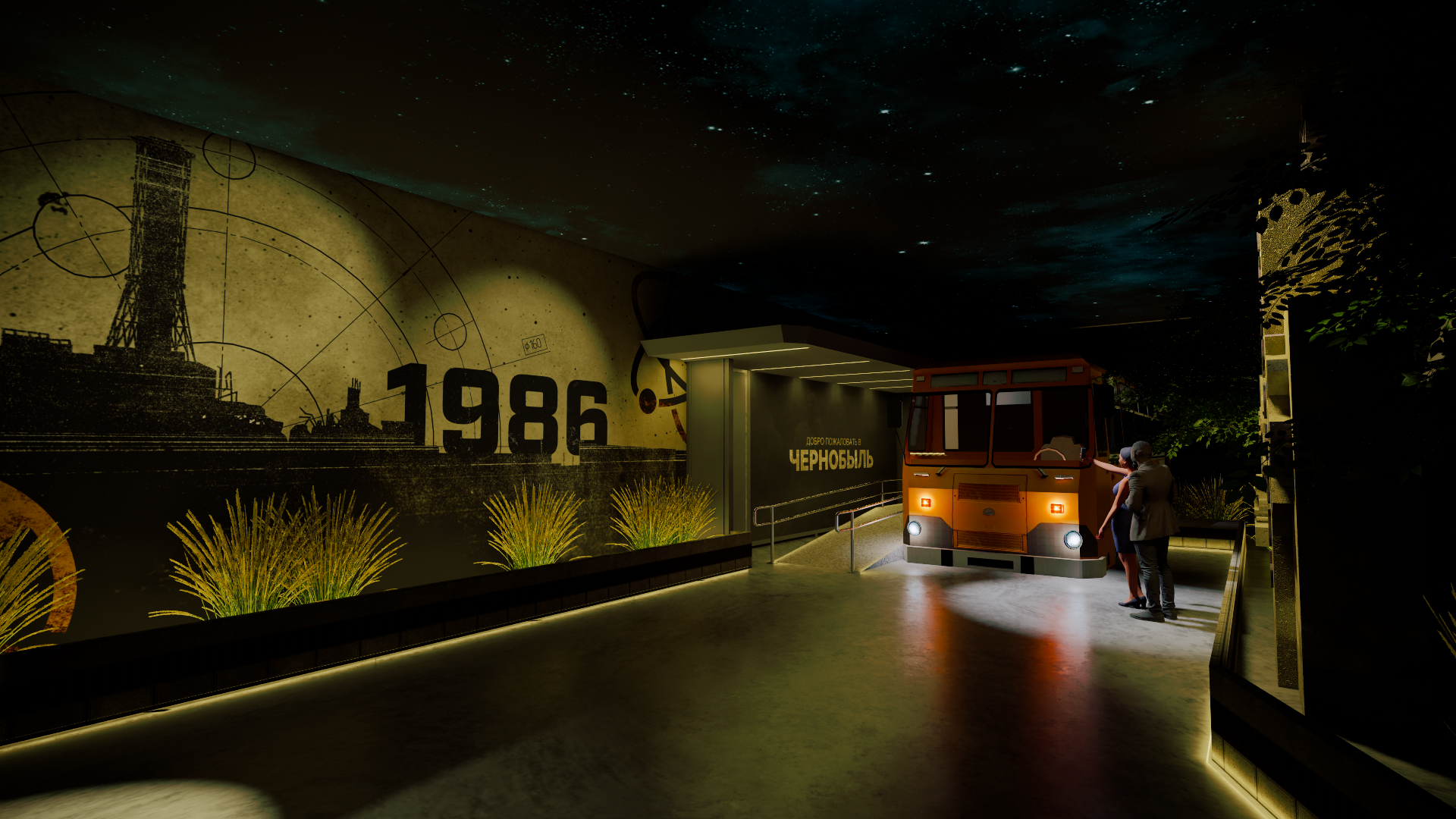
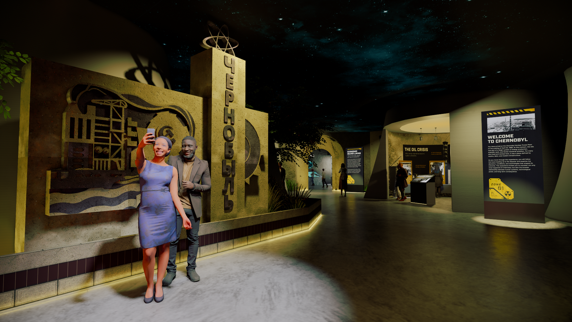
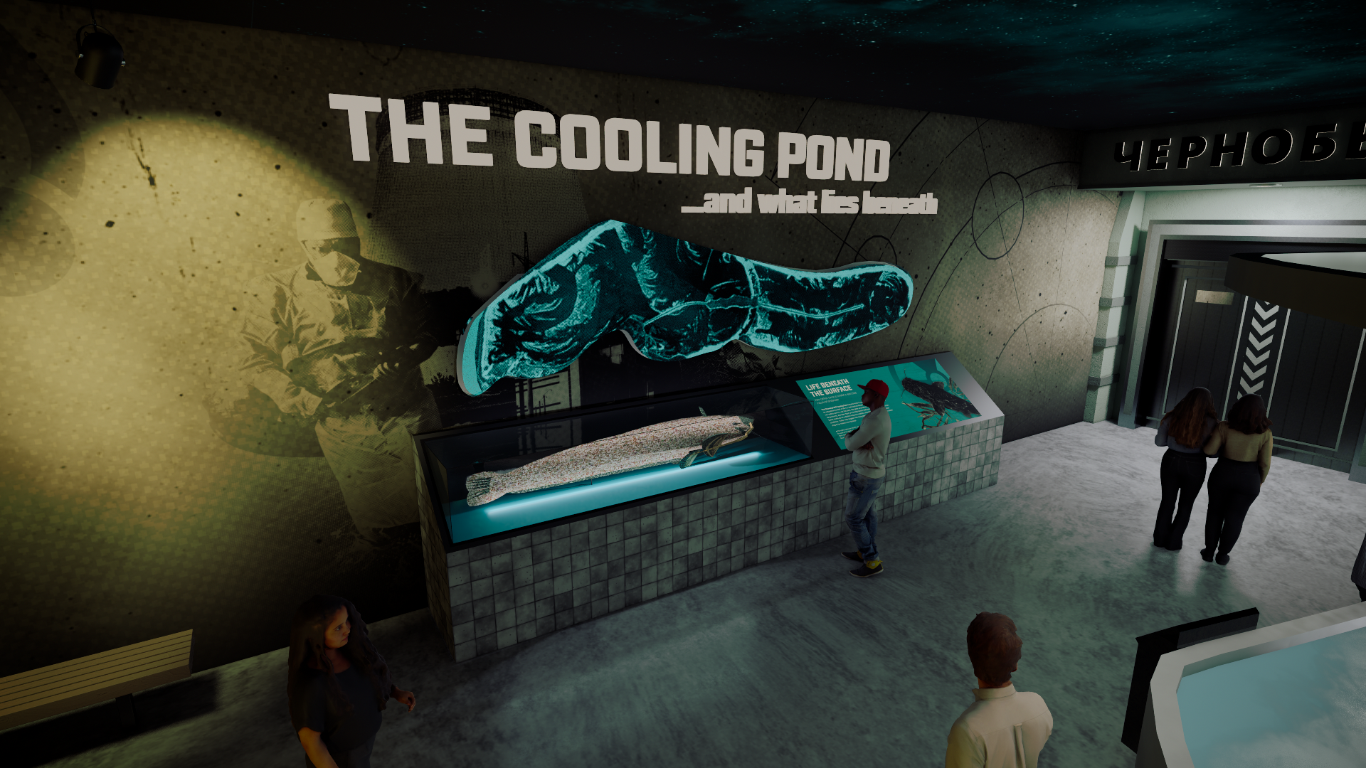
Zone 1: Arrival at Chernobyl
This opening zone transports visitors back to the spring of 1986, establishing the historical context and the initial sense of promise surrounding the power plant before the disaster.
The space uses the Hazard Yellow wayfinding system to guide visitors through a narrative of industrial optimism.
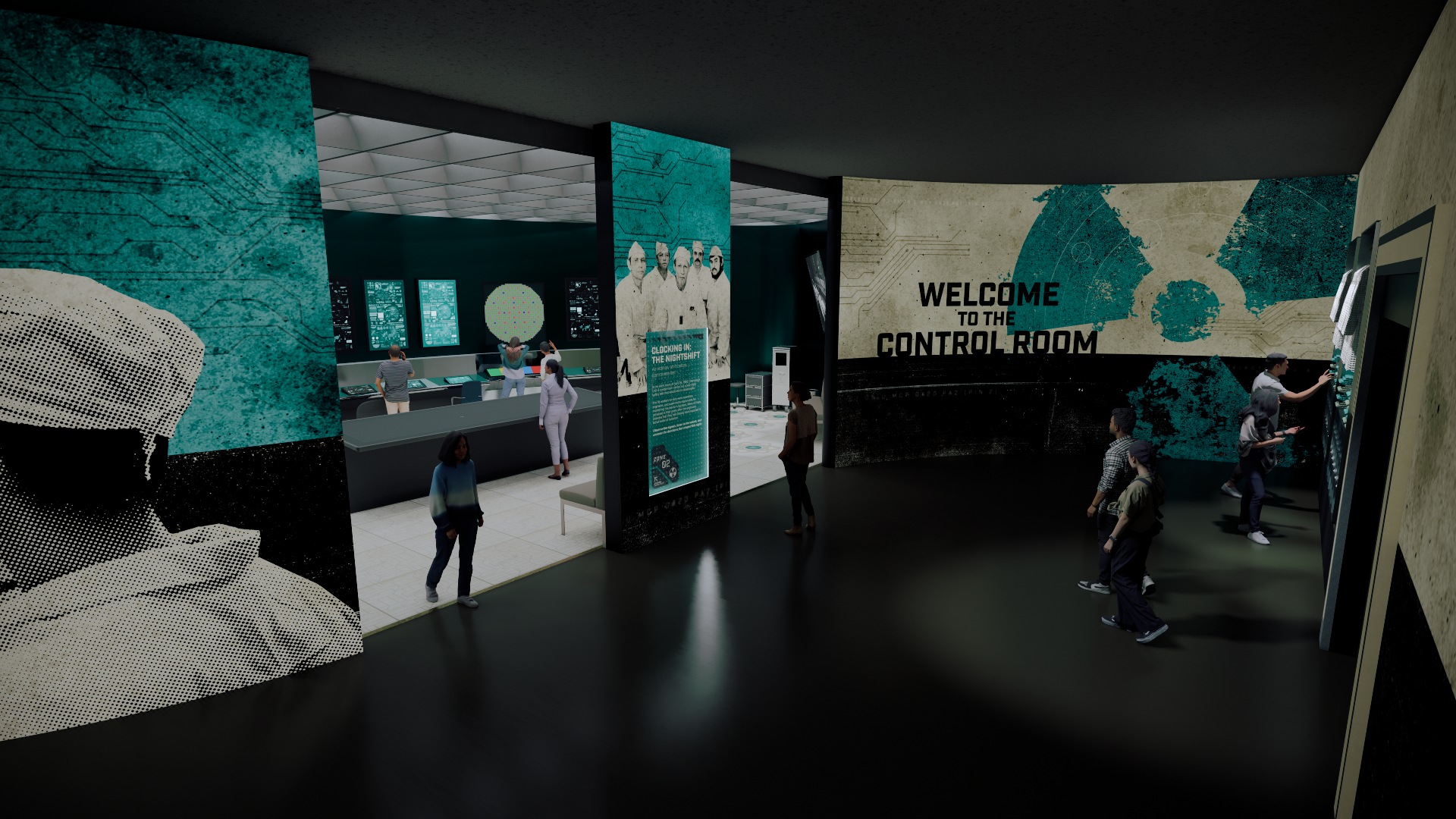
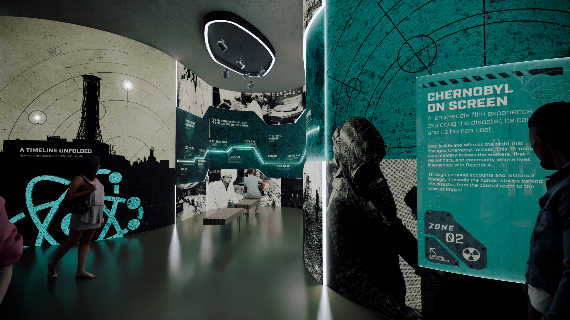
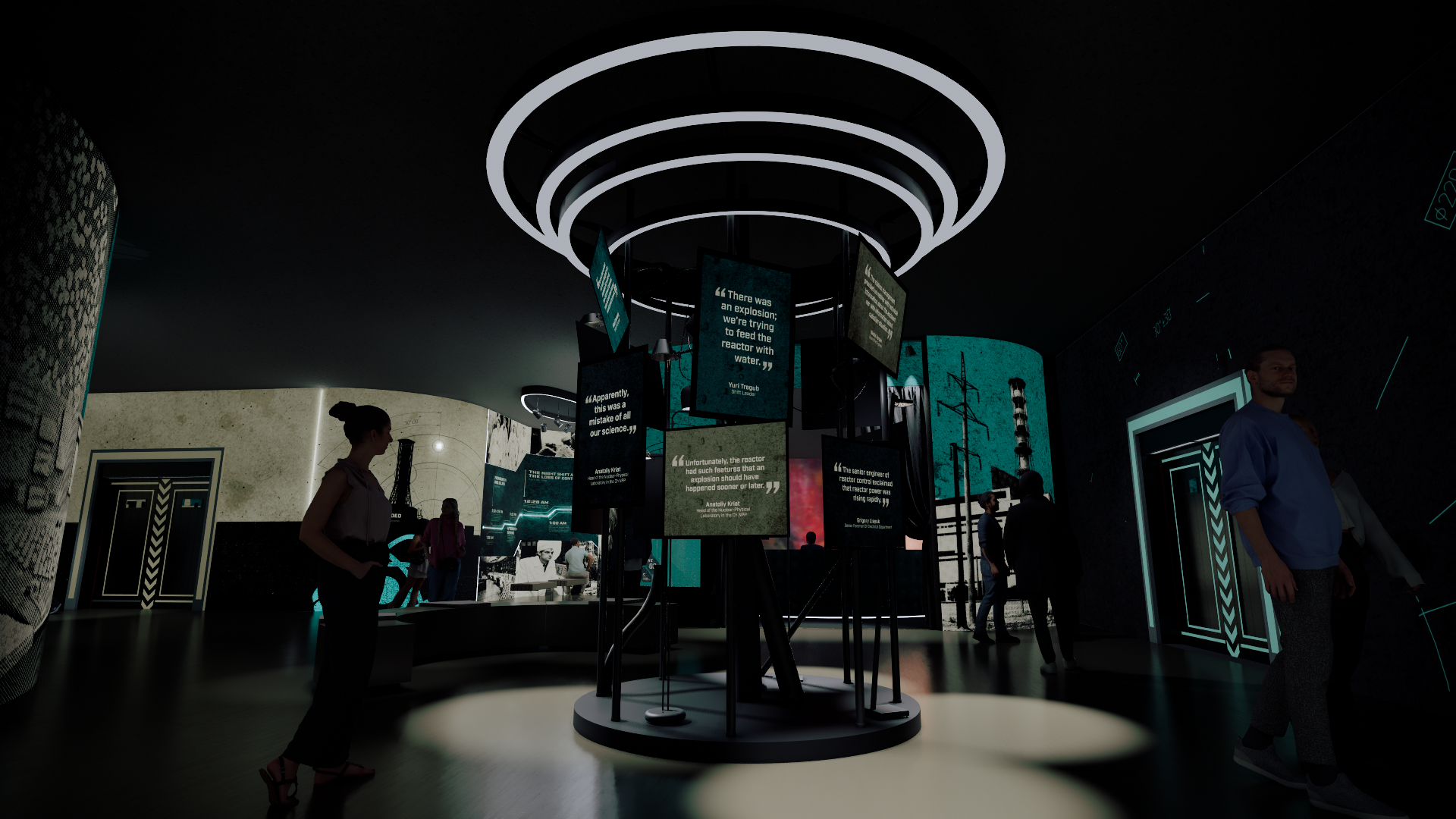
Zone 2: The Control Room
This zone shifts the narrative to the critical hours of the night shift. The space transitions to a Cyan Blue wayfinding system, mirroring the eerie glow of control panels.
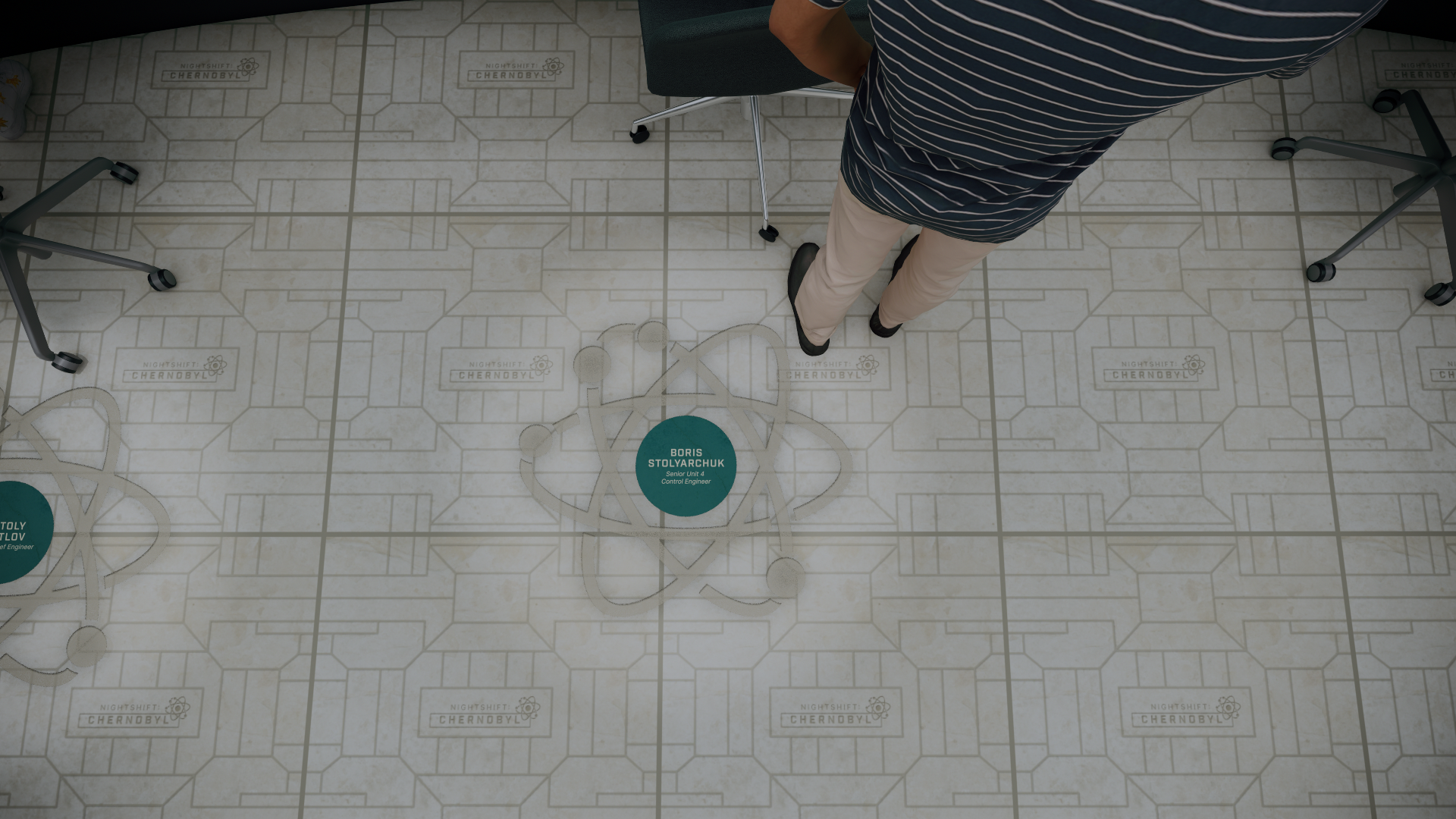
For this room, I designed a custom branded tile floor incorporating the exhibition logo and integrated floor spotlights to pinpoint where workers were positioned during the explosion, adding a layer of spatial storytelling to the environment.
Zone 5: Short Term Effects
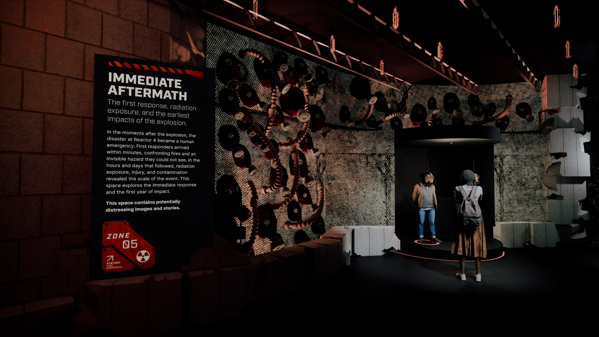
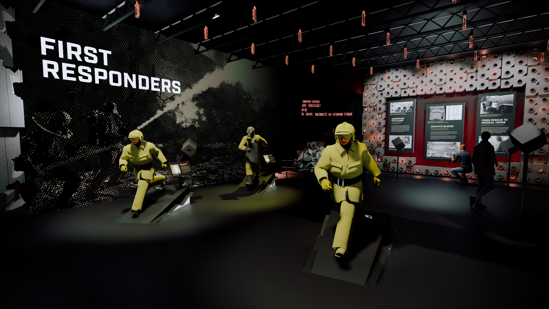
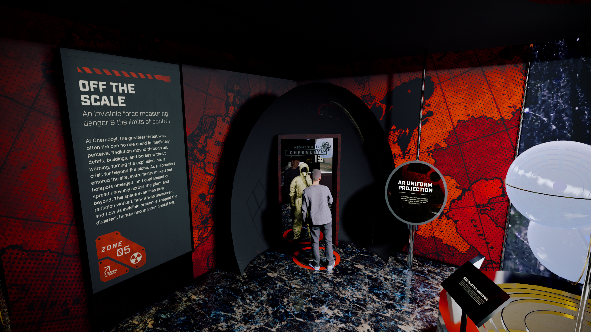
Dedicated to the emergency crews who entered the plant, this zone uses Deep Red signage, technical wayfinding, and interactive AR projections.
The visual system captures the tension of fighting an unseen threat, guiding visitors through the immediate human impact of the disaster.

05. Brand Extensions
Beyond the exhibition walls, the visual system adapts across digital marketing and physical merchandise to deepen visitor engagement.
Expanding the Experience

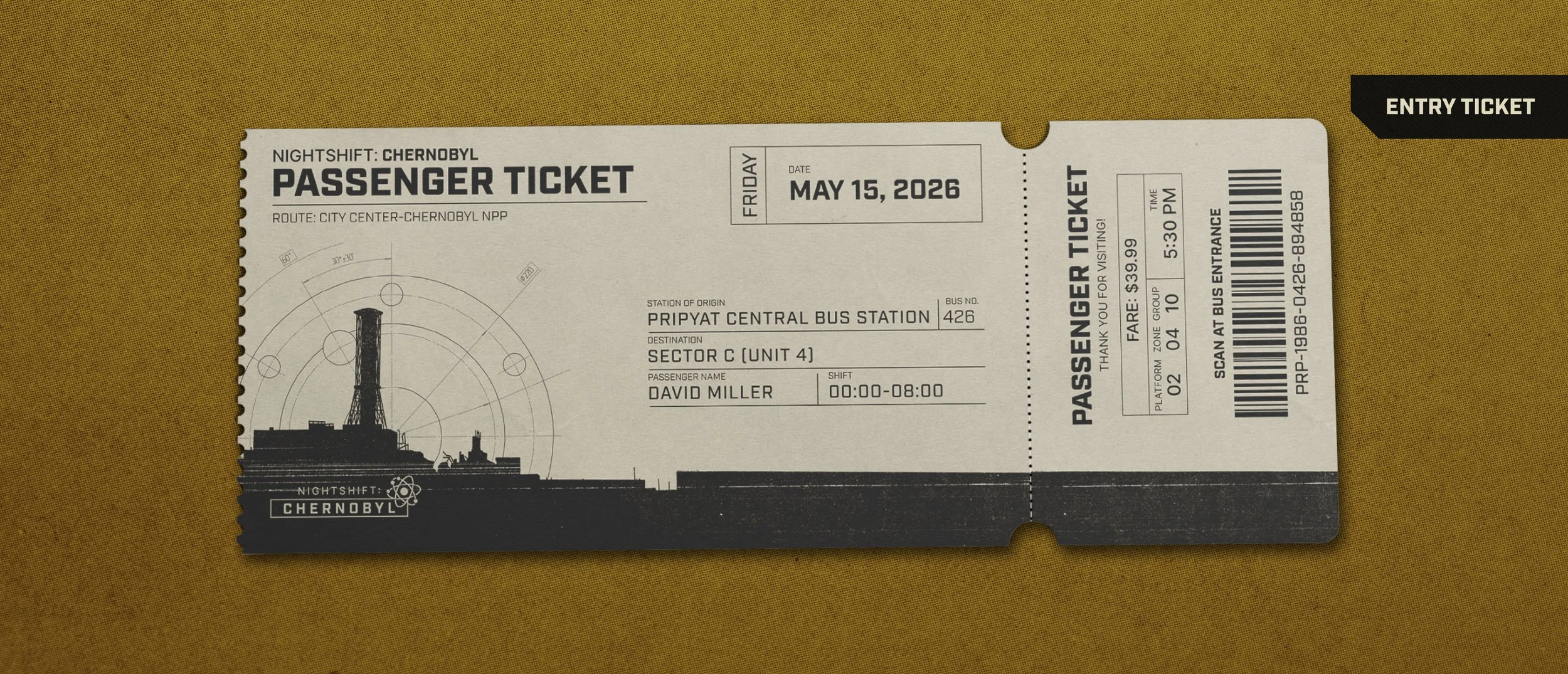
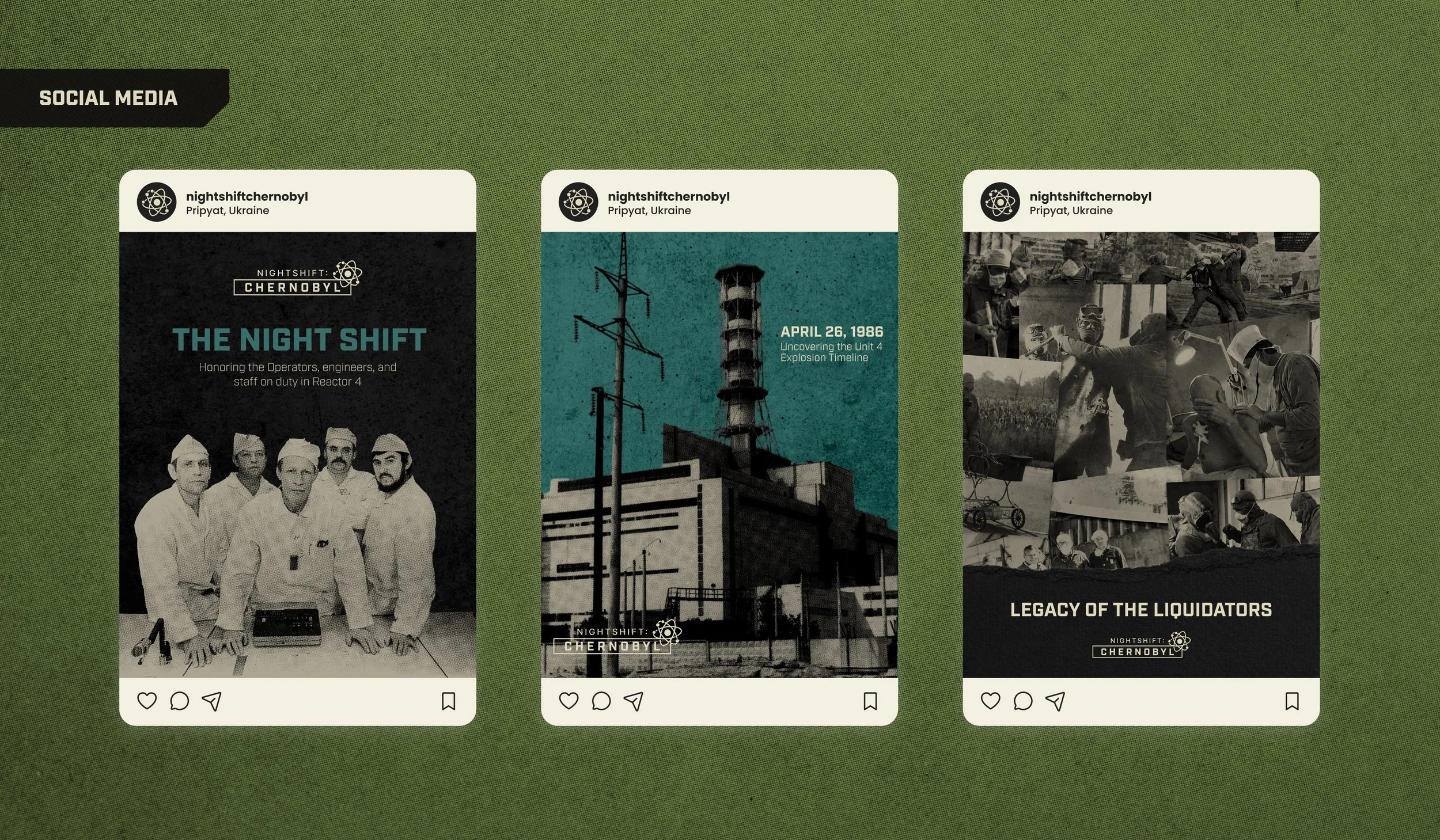
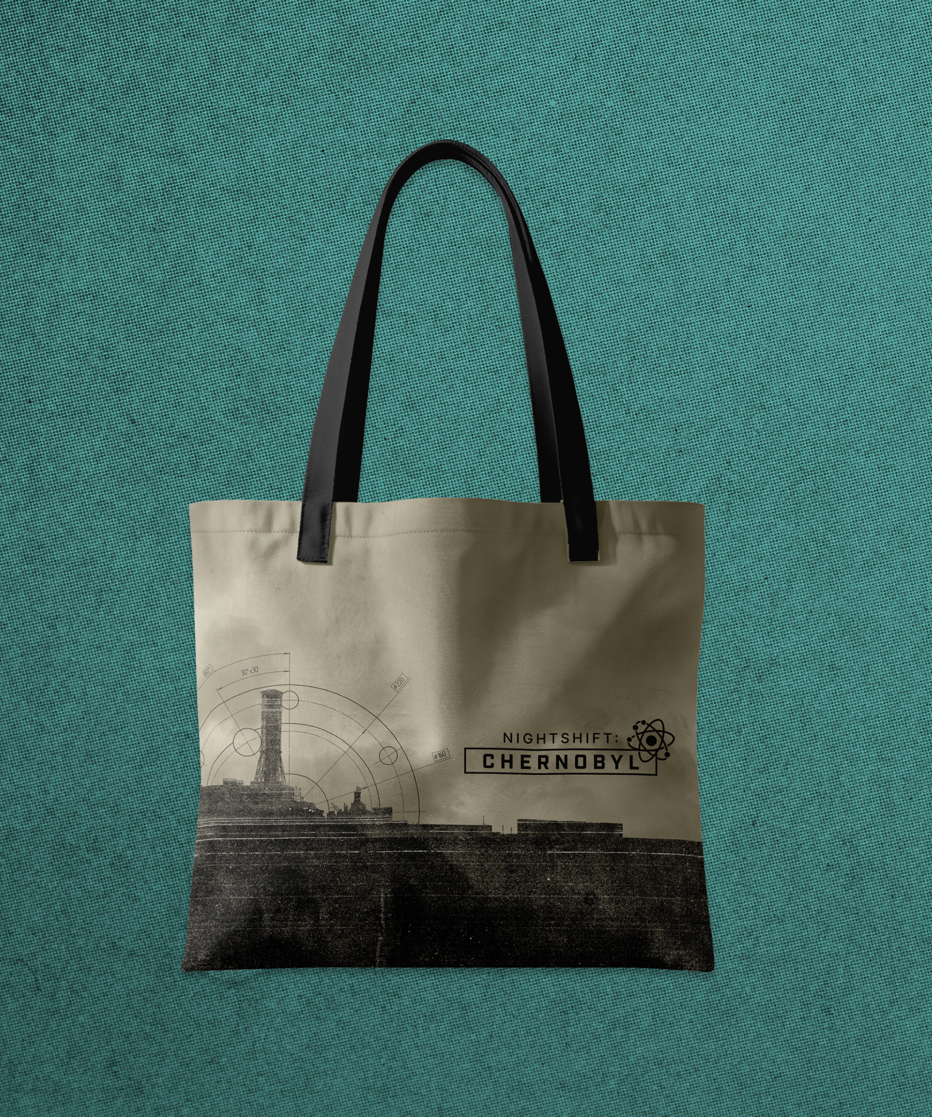
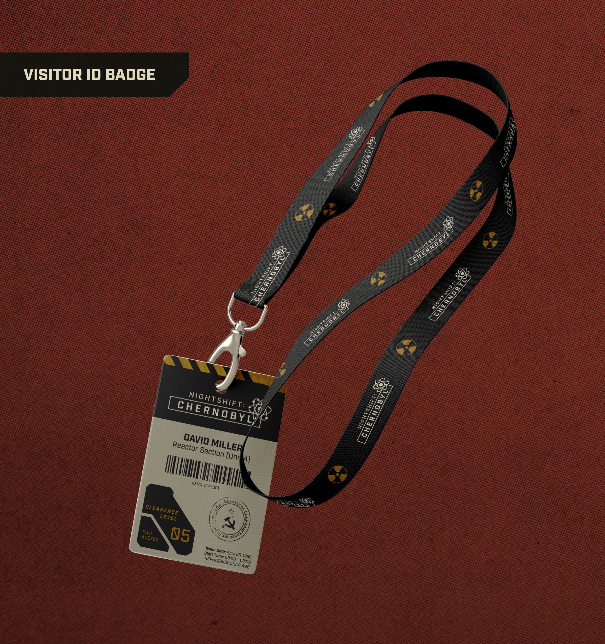
Nightshift: Chernobyl was presented in a final class review attended by faculty, school leadership, and fellow students, who walked through each team's completed exhibition concept. In a people's choice vote among the class, our project was selected as the top exhibition design. The final system, spanning branding, wayfinding, environmental graphics, and spatial storytelling, demonstrated how a cohesive visual identity could transform a physical space into an emotionally resonant, educational experience.