
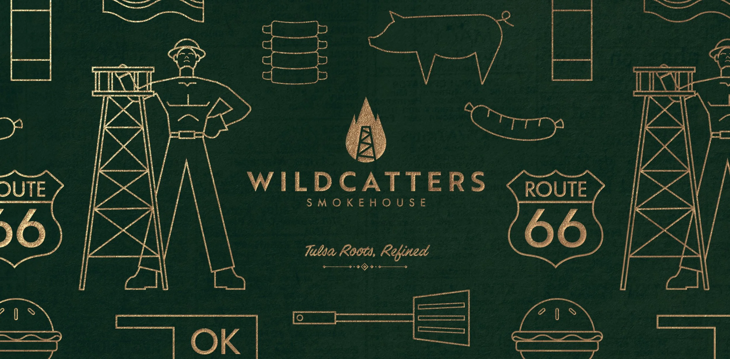
Graphic Design II · Brand Identity · Spring 2026
Wildcatters Smokehouse turns Tulsa’s oil boom history into a refined dining experience.
Wildcatters Smokehouse is a restaurant brand identity designed for my Graphic Design II course. The brief asked us to imagine where we'd send someone to eat for a day in our hometown, one dish and dining experience that captures the local people, culture, and community. For Tulsa, OK, that's barbecue. I designed a full brand identity that pairs this food culture with Tulsa's history as the "Oil Capital of the World," fusing 1920s Art Deco architecture with the raw grit of the oil fields, grounded in historical research and local market data.
Project Overview
Tulsa's identity as the historic "Oil Capital of the World" carries two very different visual languages: the raw, industrial grit of the oil fields and the opulent Art Deco luxury of the skyscrapers that oil wealth built downtown. The challenge was translating those two seemingly opposite aesthetics into a single, cohesive identity for a modern barbecue restaurant.
Challenge
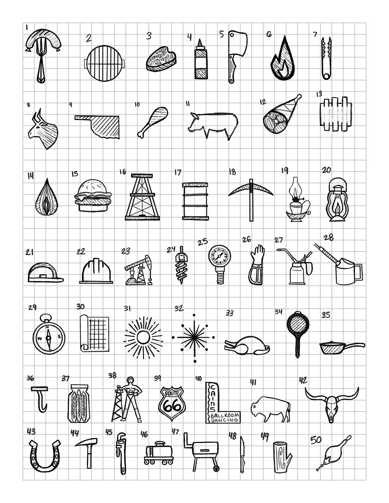
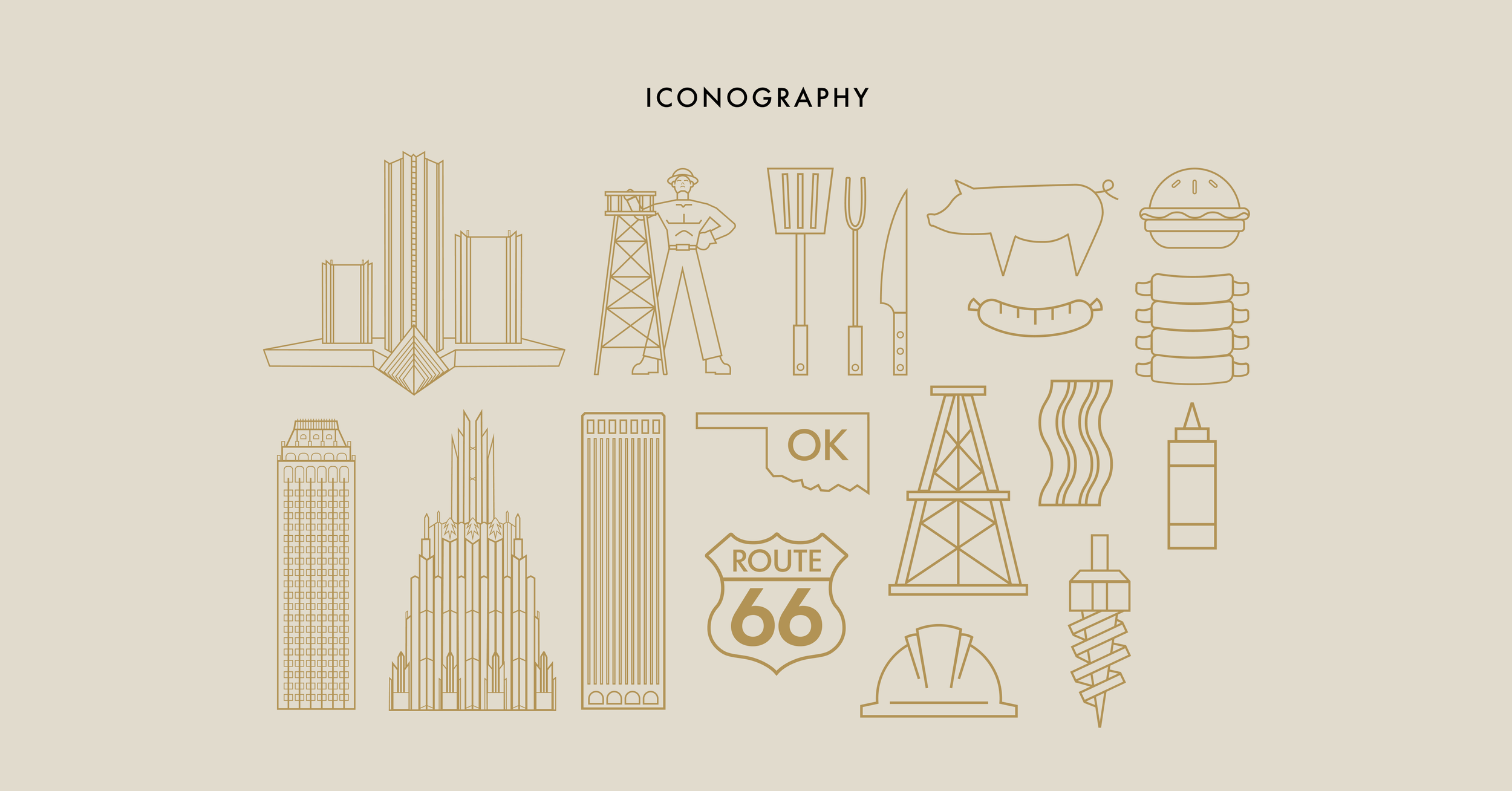
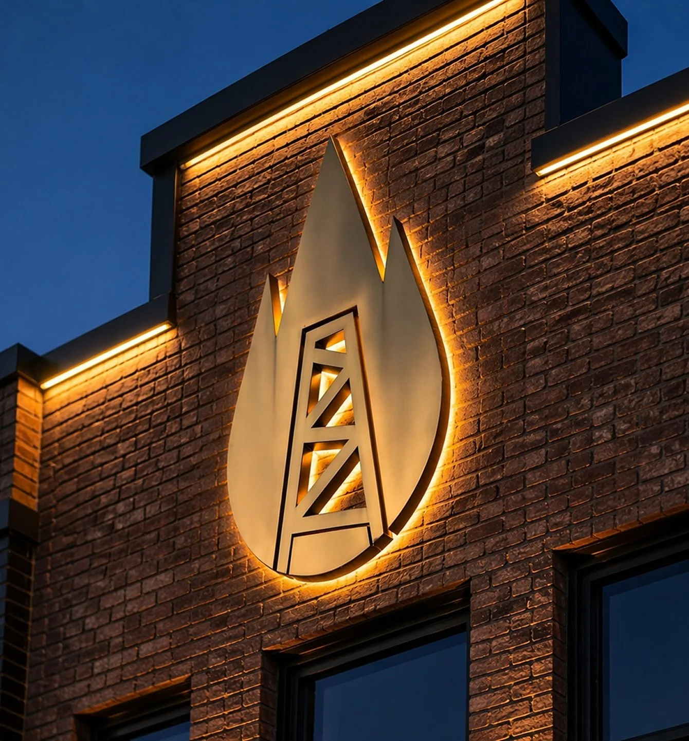
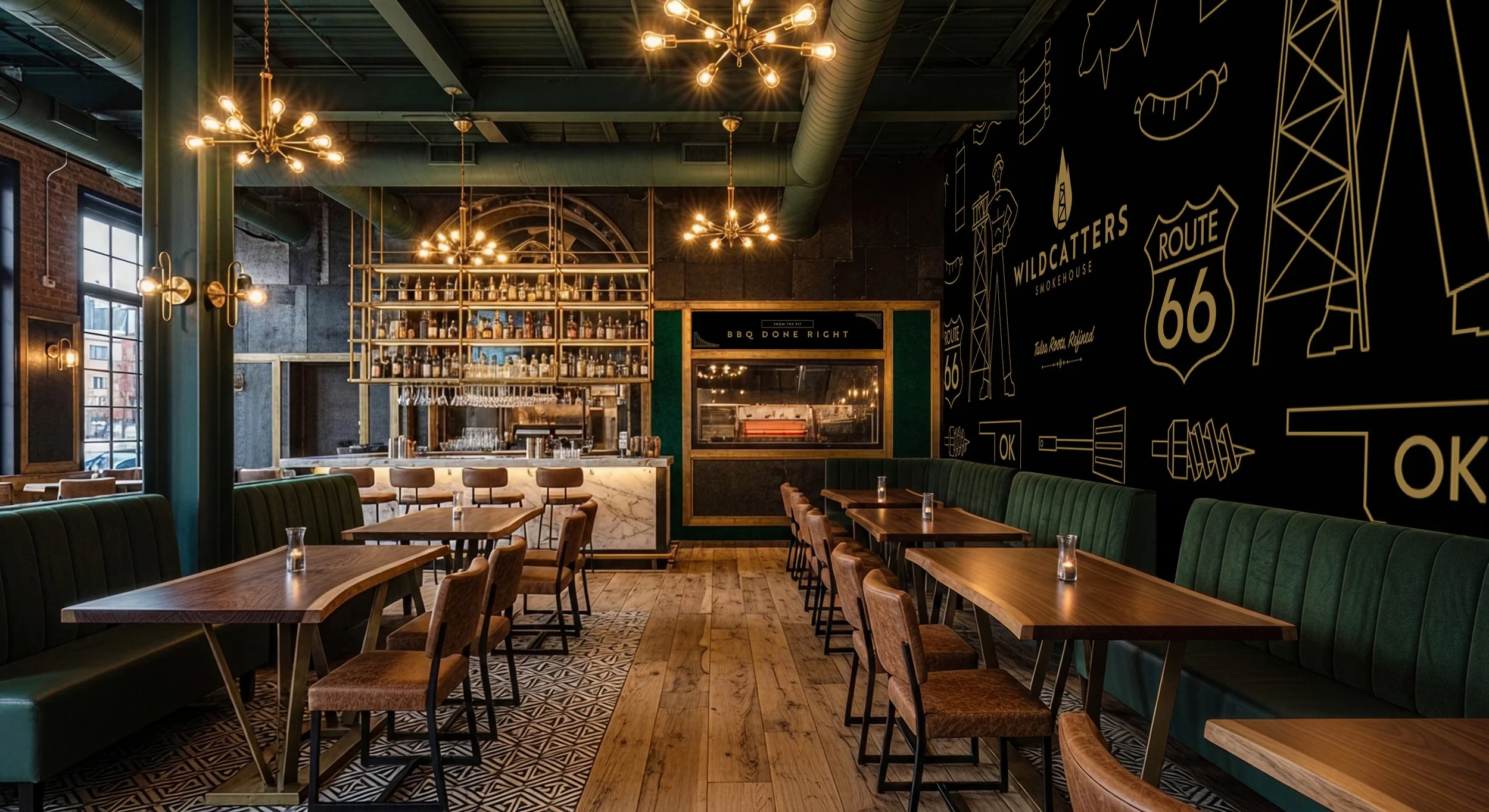
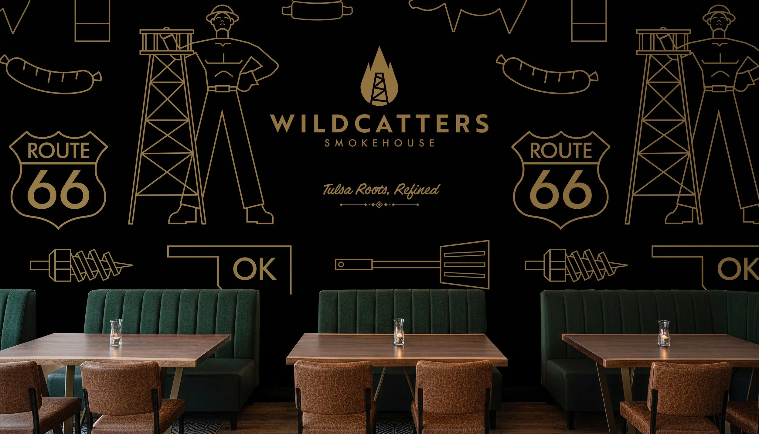
I grounded the identity in Tulsa's own history, developing a primary mark that combines an oil derrick with a flame silhouette to represent both industries the brand fuses: oil heritage and open-flame barbecue. A refined iconography system, built around Route 66, Tulsa's Art Deco skyline, and regional barbecue culture, extended that concept further. Together, these elements gave Wildcatters Smokehouse a visual identity that feels both historically authentic and modern.
Solution
Research
Background & Historical Context
Driven by the 1905 Glenn Pool discovery, Tulsa's transformation into the "Oil Capital of the World" brought immense wealth during the 1920s boom town era. Oil barons channeled their fortunes into downtown real estate, building the world-renowned Art Deco skyscrapers that still define the skyline today.
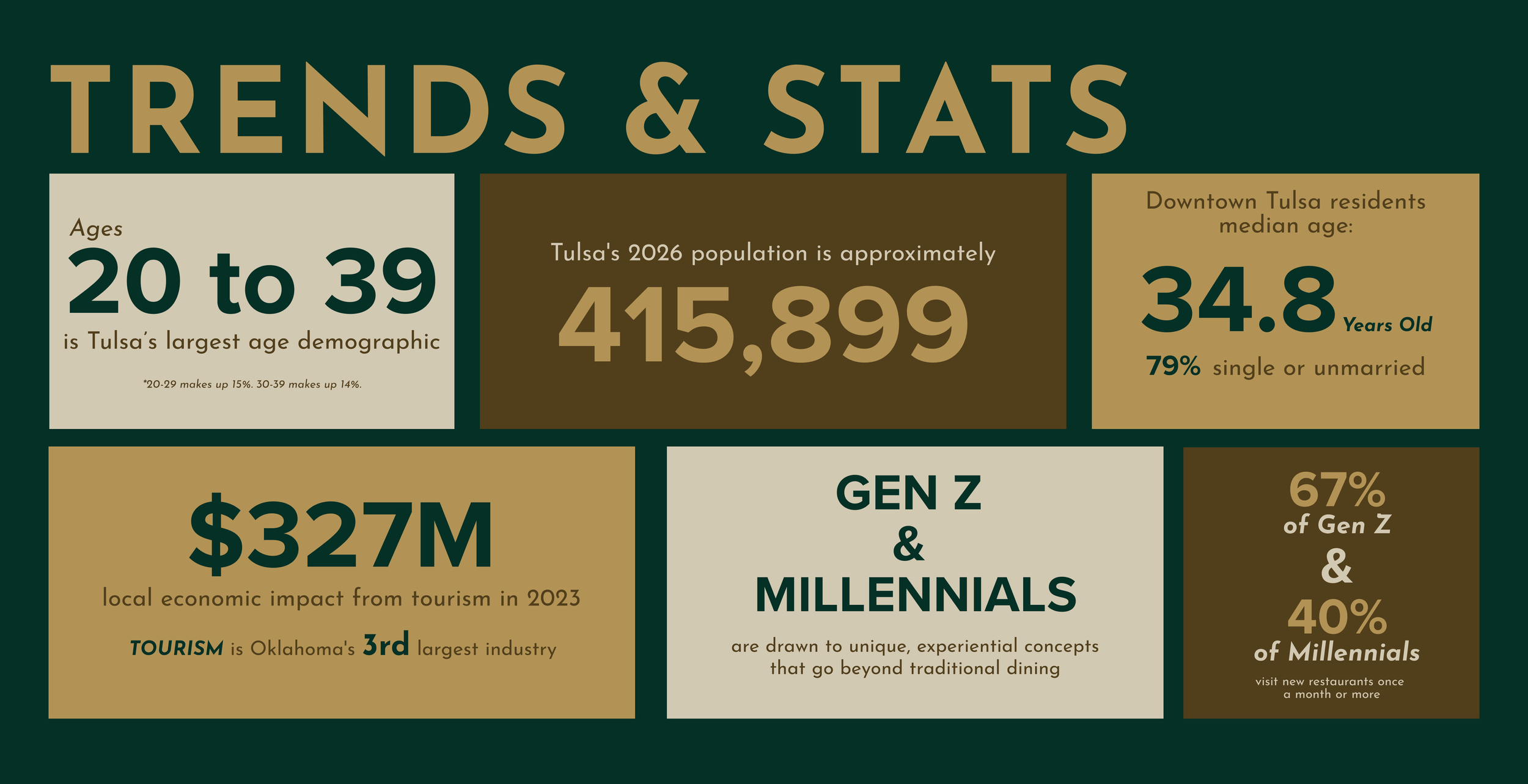
Market Insight
After analyzing Tulsa's dining data, I spotted an opportunity: the city's largest demographic is young, growth-driven, and actively seeking experiential dining, yet local barbecue spots default to traditional, familiar branding. I built Wildcatters Smokehouse to capture that gap, crafting a refined identity that fuses Tulsa's Art Deco oil boom history with craft barbecue, brought to life through custom iconography, a historically grounded color palette, and a distinct logo mark.
Brand Identity
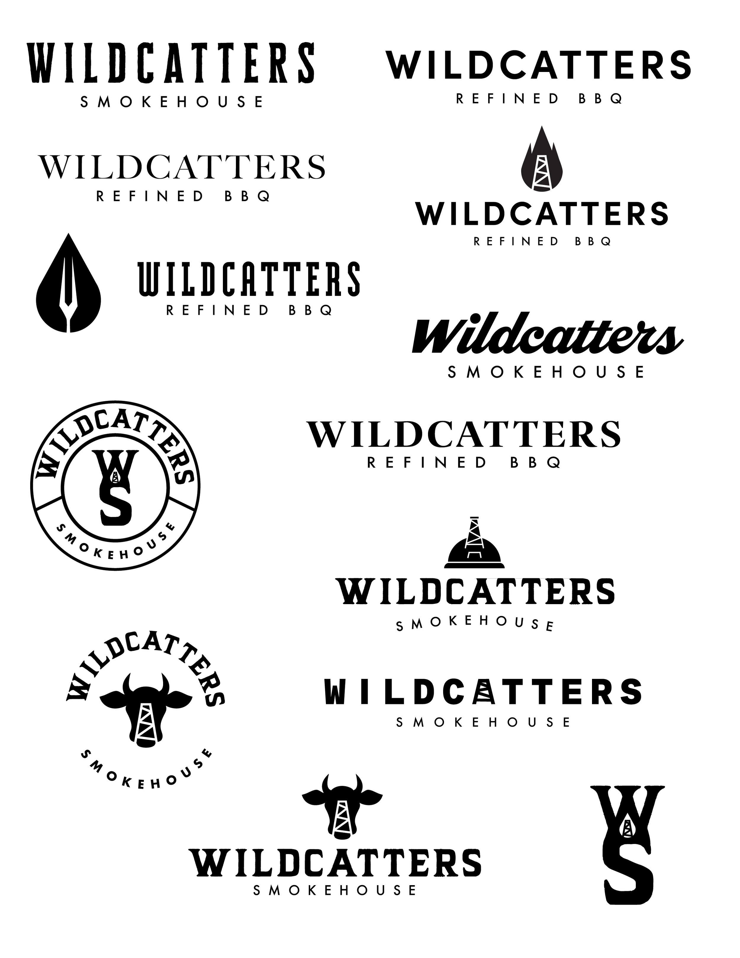
Logo and Icon Exploration
Logo Design
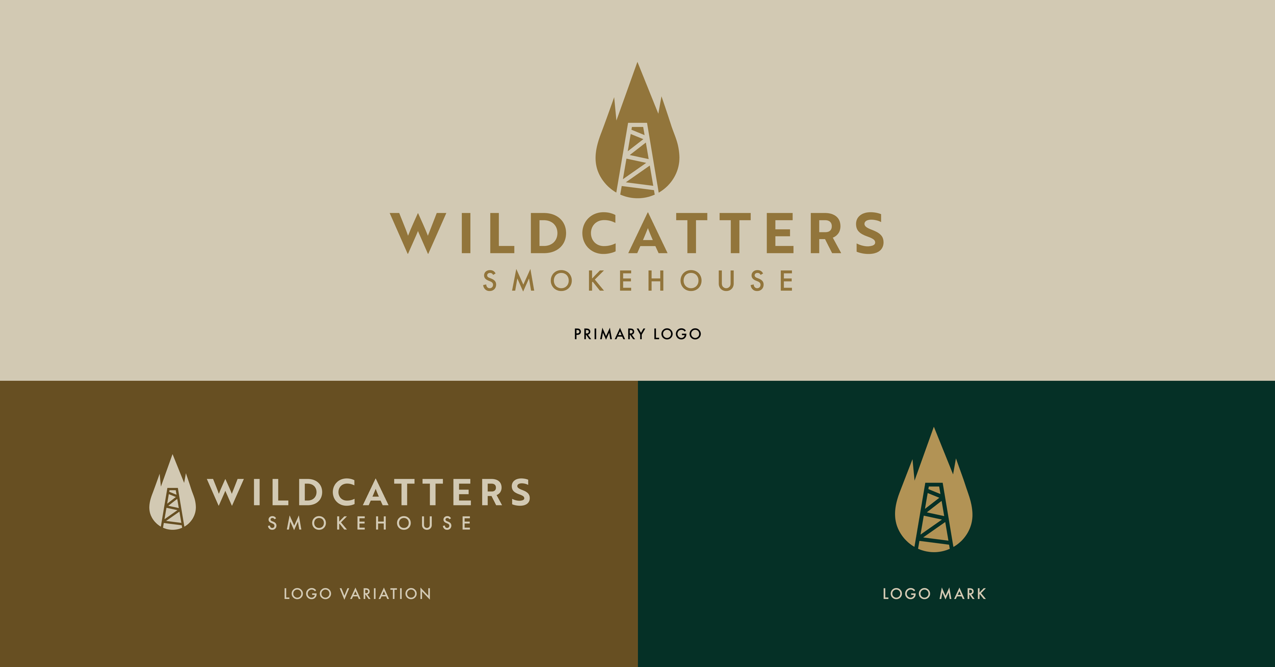
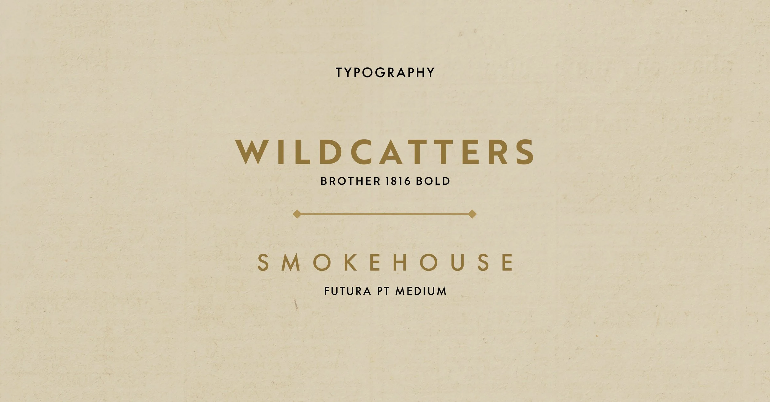
The final mark combines an oil derrick silhouetted inside a rising flame, one shape representing both halves of the brand's story: Tulsa's oil boom heritage and the open flame at the heart of barbecue. The wordmark pairs Brother 1816 Bold with Futura PT Medium, two geometric typefaces chosen to give the brand a clean, modern look that balances its historical inspiration with contemporary appeal.
Color Palette
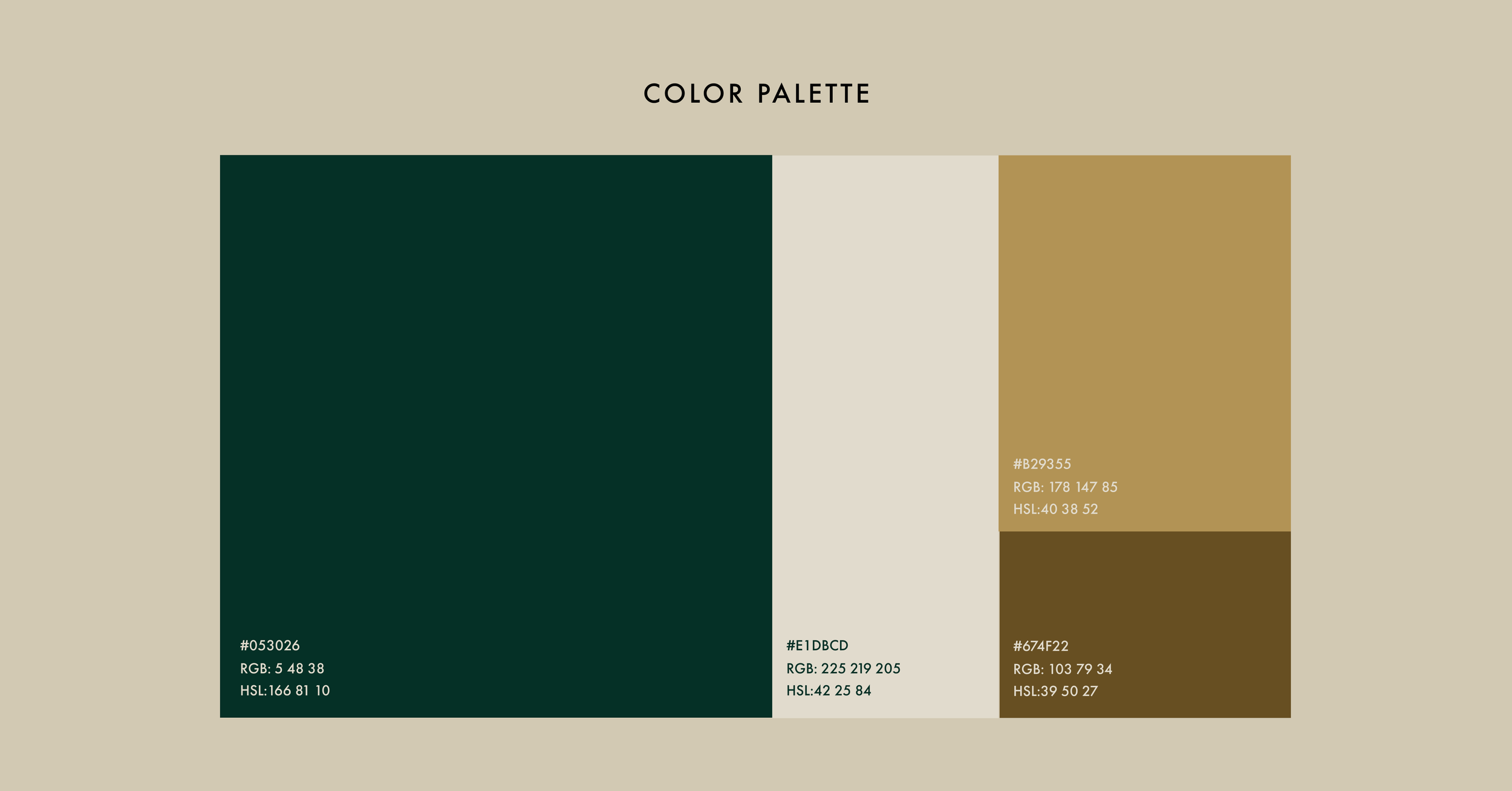
The palette centers on a deep emerald green, a nod to Tulsa's nickname "Green Country" and a color historically paired with gold in Art Deco design to signal wealth and opulence. Gold reflects that same luxury and the warmth of an open flame, while a bronze-brown brings an industrial, brass-like grit that echoes the oil fields. Cream grounds the palette with a soft, vintage warmth.
Customer Journey
To show the identity working as a full brand system, I mapped the Wildcatters Smokehouse experience across three touchpoints: Before, During, and After the Visit. Social and web content draw guests in before they arrive; signage, uniforms, and menus carry the brand through the space; and takeaways like BBQ sauce and matchboxes keep it with them after they leave.


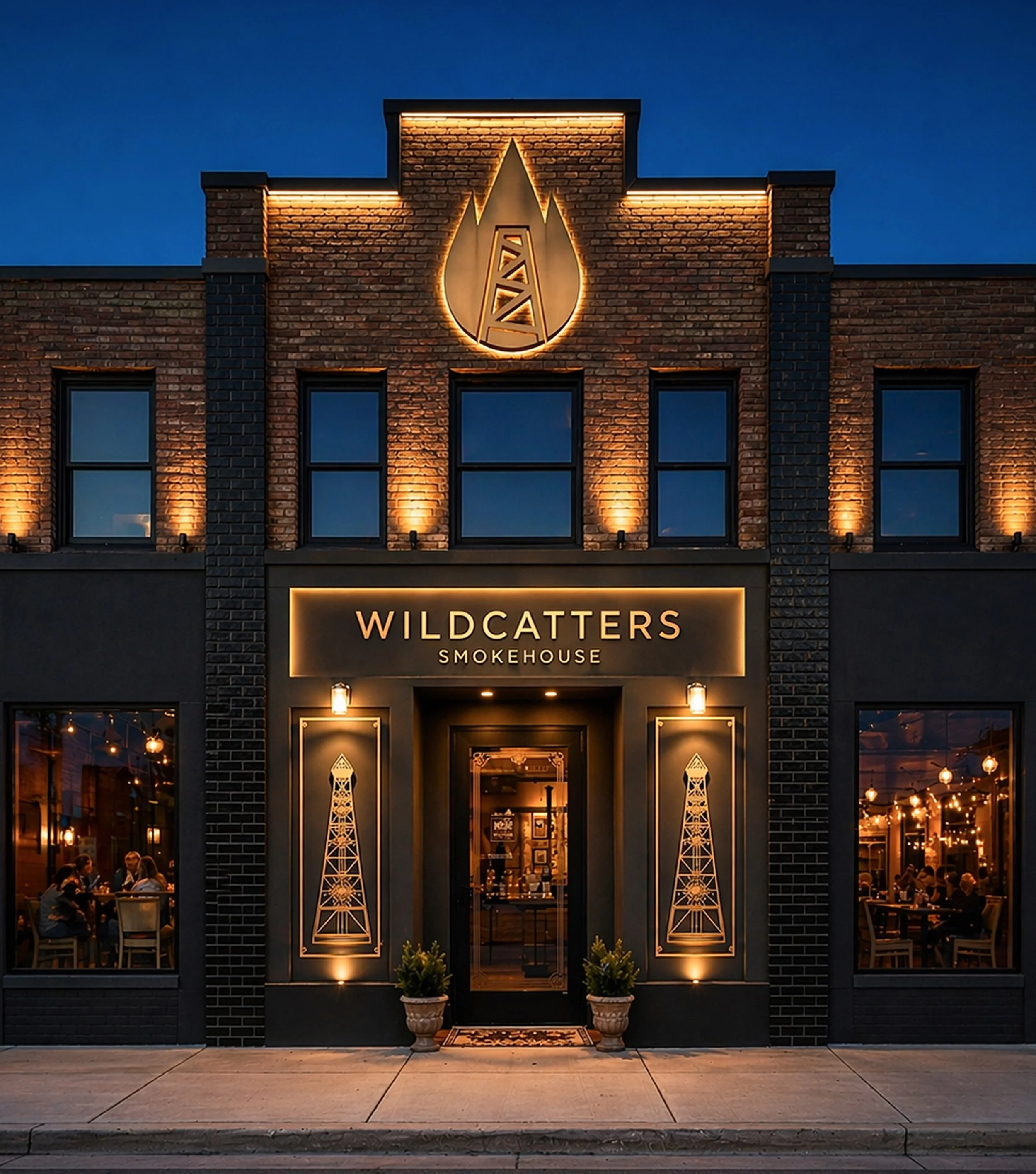
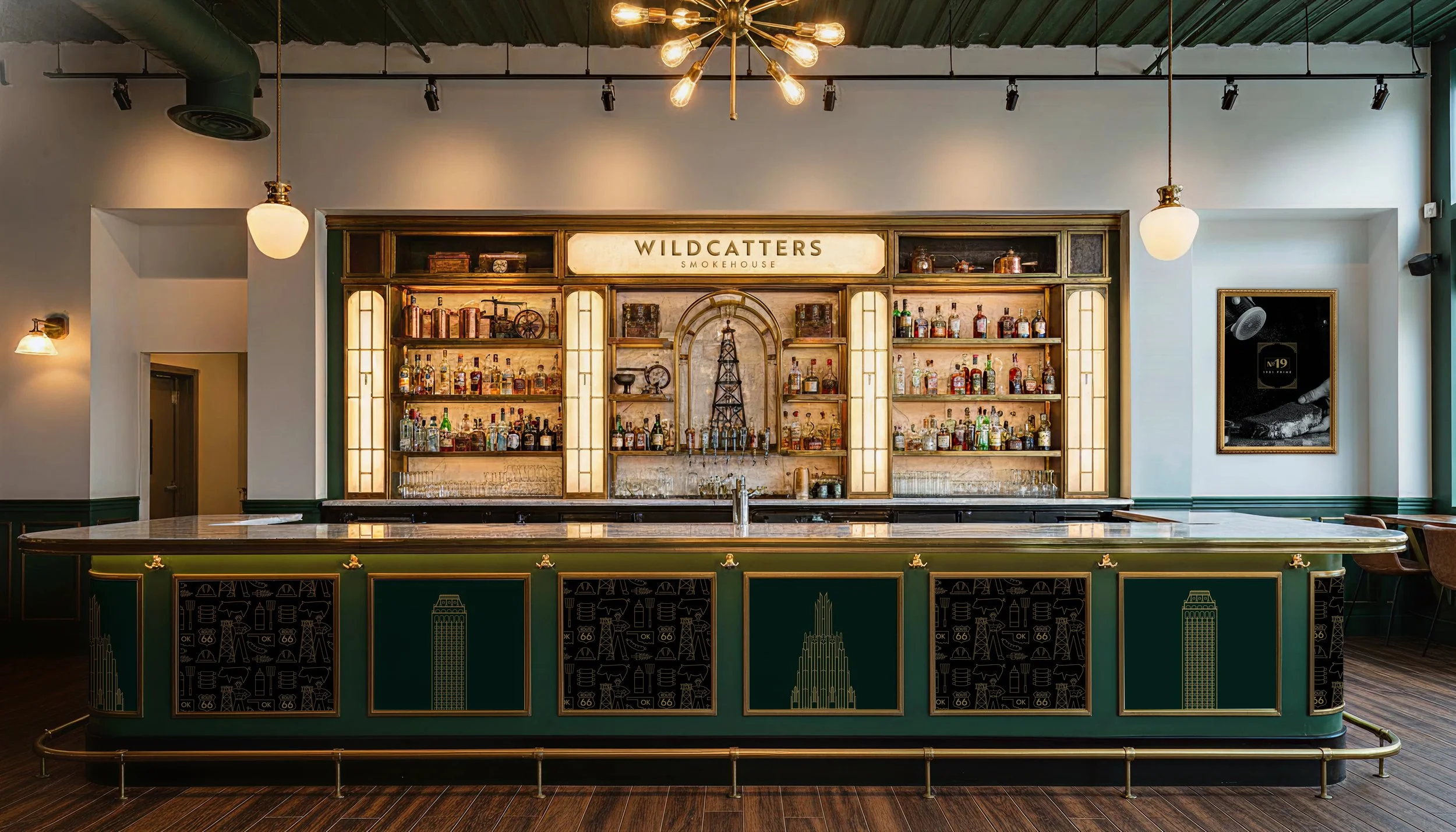
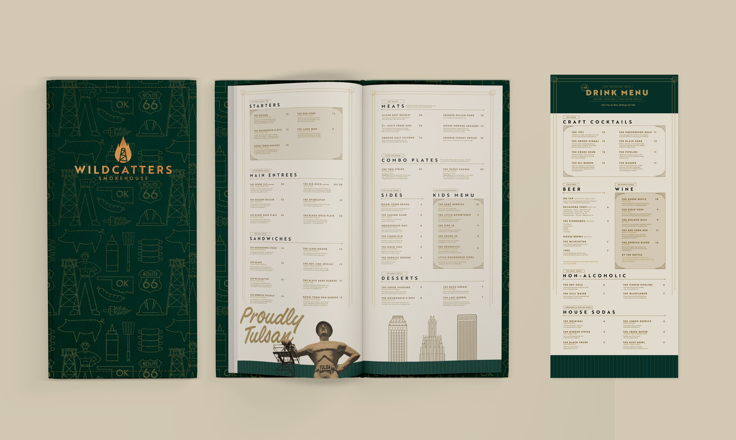
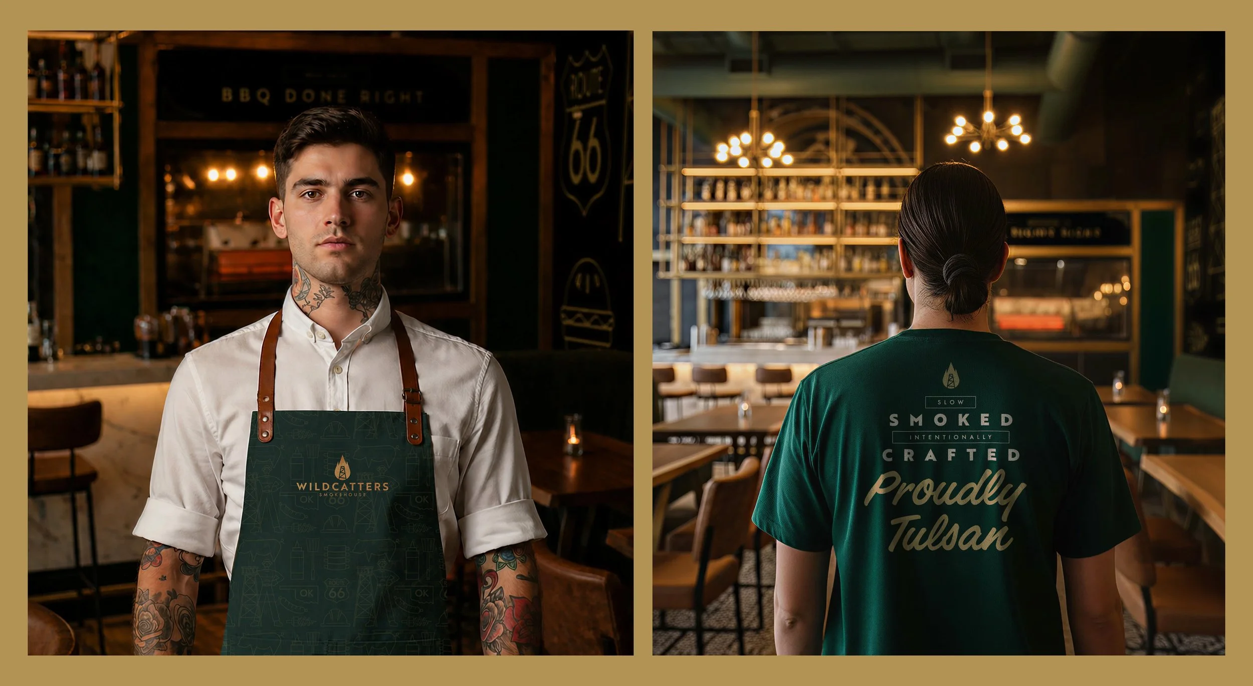
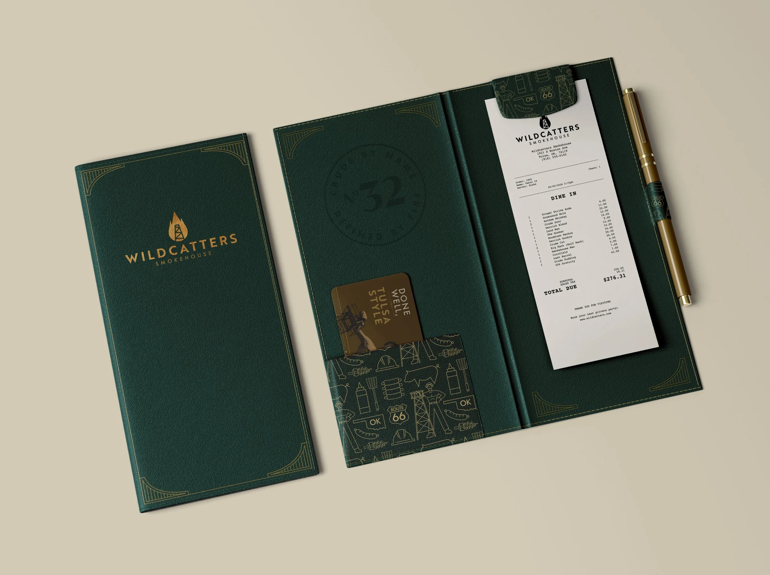

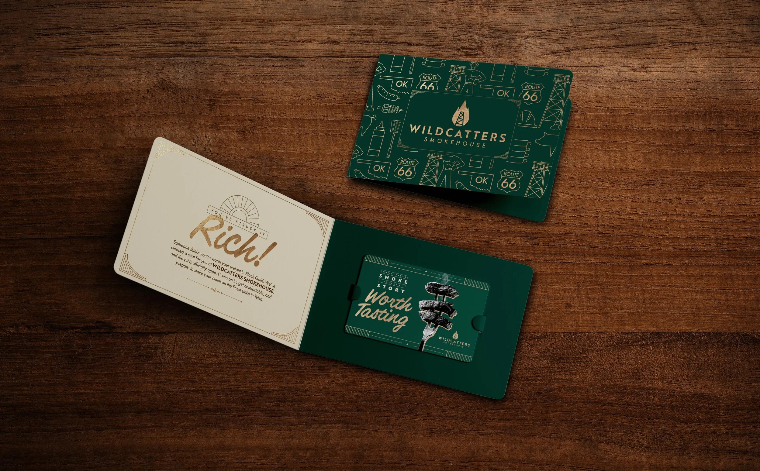
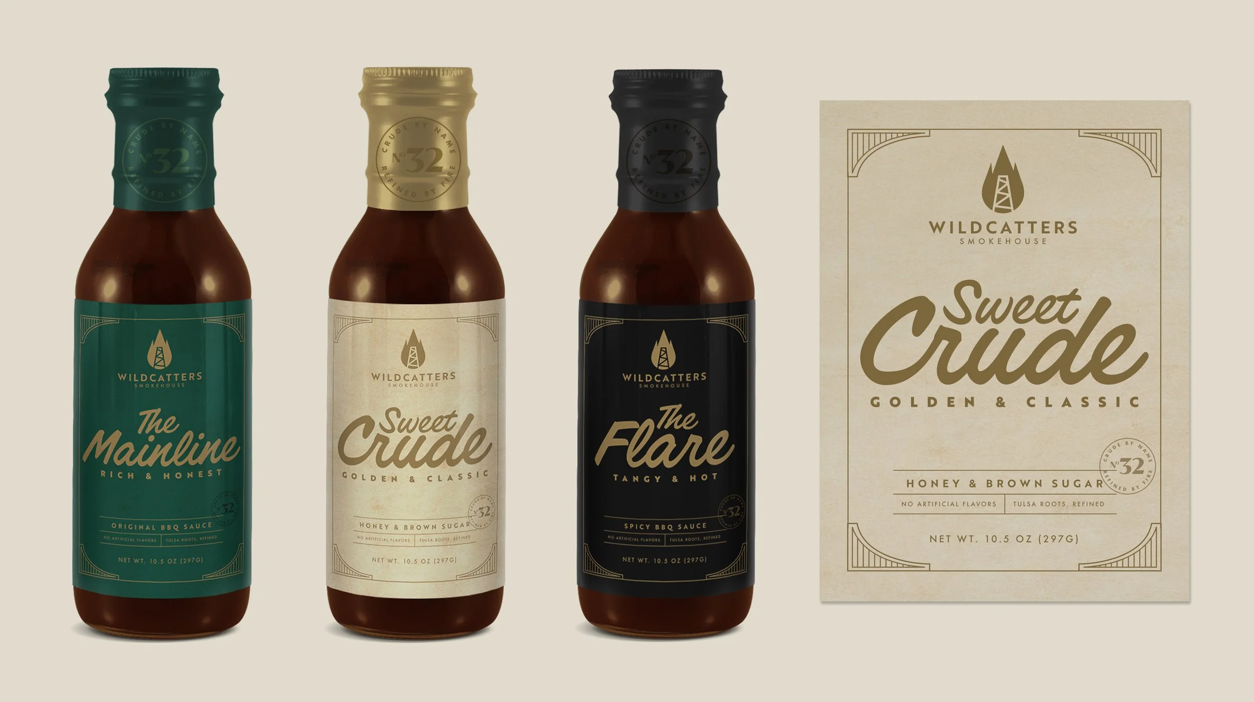
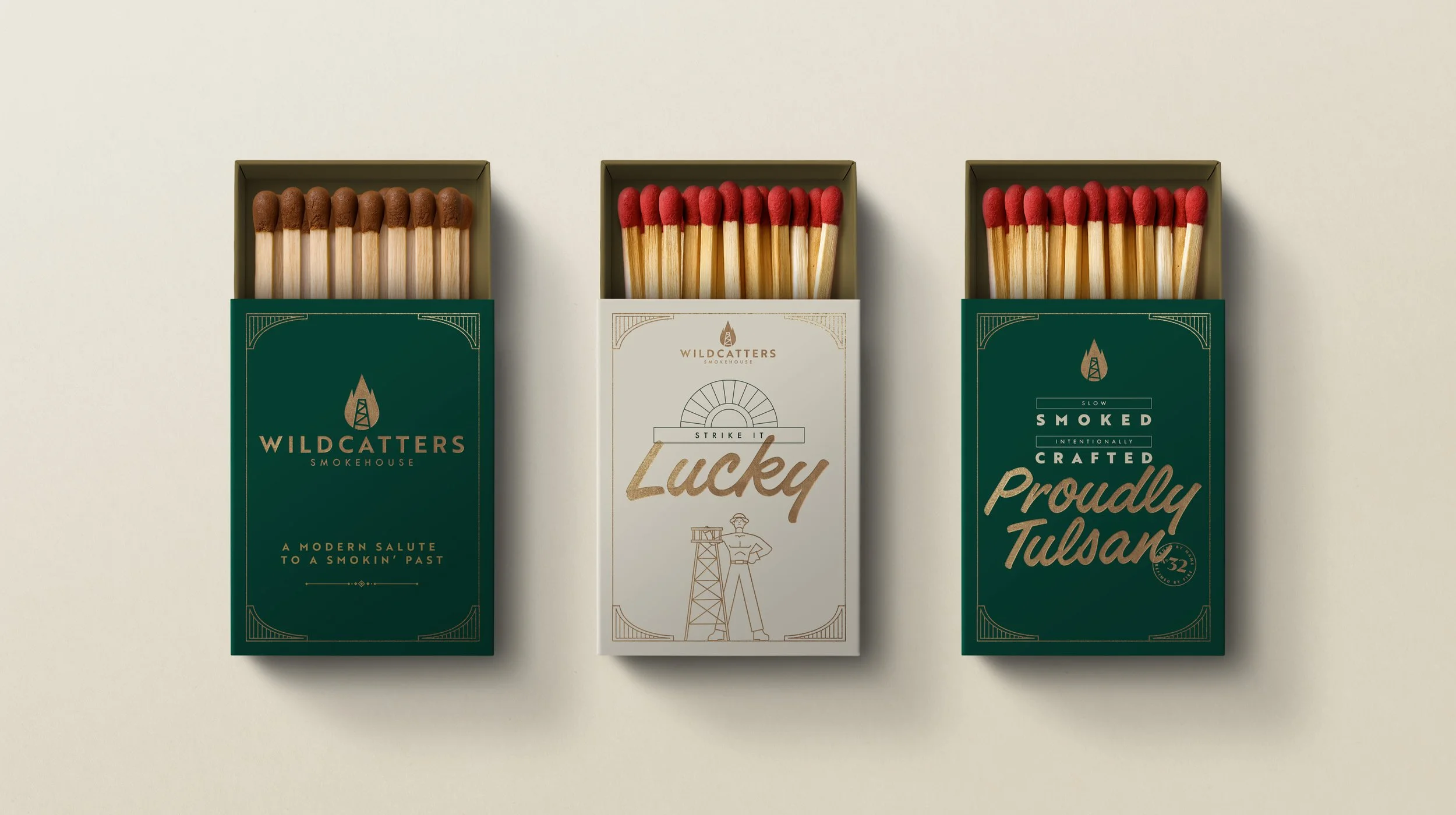
This project pushed me to translate historical research and audience data into a cohesive visual system, extended across every stage of the guest experience. The result is a complete brand identity for Tulsa, balancing its Art Deco past with a modern, design-forward dining concept.
Because the concept is rooted in oil boom history, its core system could scale to similar regions, like Beaumont, Texas, home of the Spindletop oil boom, with a new tagline (e.g., "Beaumont Roots, Refined") and city-specific iconography, while keeping the same underlying identity.